Case study · 01 / SirFolajomi OS
Making an AI-built console readable
An AI-generated console that ran fine and read like noise. Rebuilt on a token system written before any screen. Four thousand records now resolve to the fourteen that need a person today.
Open a bucket, then walk back to the raw figure.
Inbound
Did we drop anyone? Four channels, one rollup
The verdict
every at-risk bucket, all four channels
Silent-by-design is never counted as dropped: the sandbox lock and vendor mail are policy, not misses.
Channel ledger · 4
today’s response meter · 7-day pair
Email
poller · SQL, always live
12 responded of 15 received today
12 responded · 3 unanswered
103 received 7d
39 vendor mail 7d
3
unanswered > threshold
oldest waiting 297h 36m
WhatsApp
poller · SQL, always live
0 responded of 1 received today
0 responded · 1 unanswered
1 received 7d
0 responded 7d
1
unanswered > threshold
oldest waiting 443h 52m
IG comments
Hermes IG-comment exporter · snapshot bridge
53 responded of 61 received today
53 responded · 8 unanswered
3,955 keyword leads, all time
52 sampled for a human
8
stuck: actionable, window open
IG DMs
Hermes DM exporter · snapshot bridge
0 responded of 2 received today
0 responded · 2 unanswered
0 responded 7d
100 sandbox-gated today
2
other silent: needs a look
0 escalated, human owed
need a human now3 + 1 + 8 + 2 =14
Amber is the signature: if nothing is amber, the morning is clear.
- Year
- 2026
- Role
- Design System, Product Design, Front-end Build
- Client
- SirFolajomi, property education & brokerage, Lagos
- Starting point
- Working AI-generated app, 10 screens, no system
- Built with
- Claude Code · design tokens first
- Outcome
- 4,000 → 14, records reduced to the ones a human actually owes a reply
The short version
Generated code can give you an app. It cannot give you a point of view.
- An AI generated a console that ran fine and read like noise. Running is not the same as arguing.
- The rebuild started with tokens, not screens: the system was written before a single surface was drawn.
- 4,000 records a day now resolve to the 14 that need a person today. Amber means a human decides; no amber means the morning is clear.
- Every number keeps its unit, every figure is monospaced, and every verdict can be walked back to the raw count that produced it.
What was wrong
What the old experience made people do
01
Colour meant loudness, not meaning
On the Inbound screen 3,012 was red, 553 was white, 16 was white and 1 was amber. Red had been used because the number was big, not because anyone could act on it; those records had aged out of Instagram’s reply window days earlier. The 1 was the only genuinely actionable figure on the card, and it was the smallest thing on it.
Fixed by giving each hue exactly one job and never overriding it for emphasis.
02
The screens contradicted each other
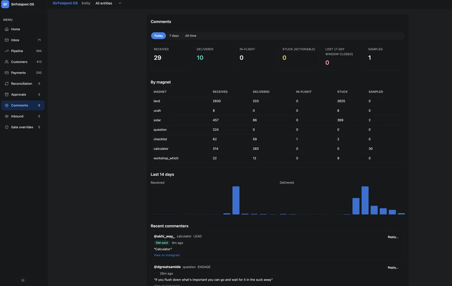
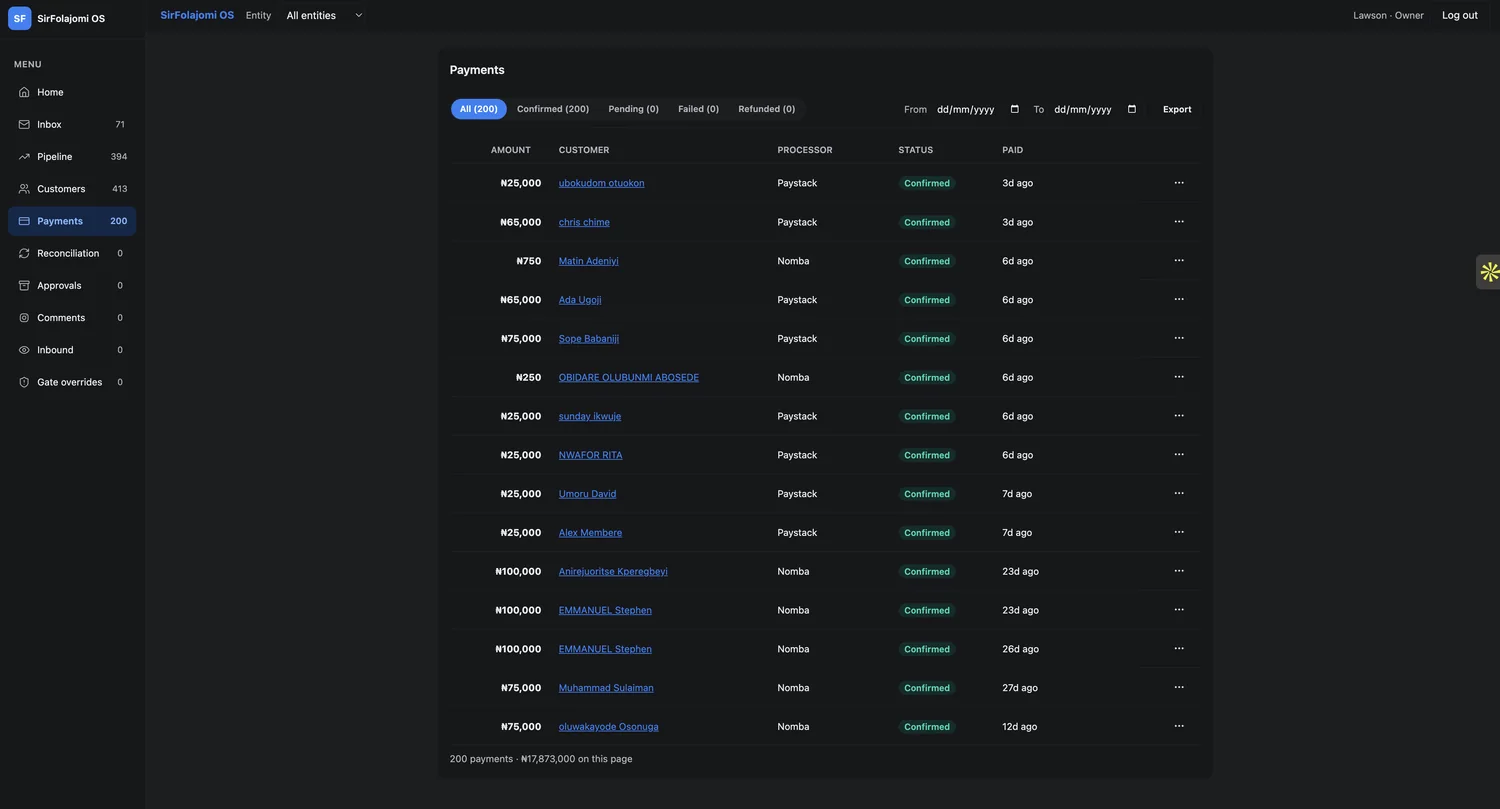
Comments, filtered to Today, reported 29 received, above a table on the same screen listing 2,830 for a single keyword. Home reported ₦29,201,000 for the month; Payments totalled ₦17,873,000 and hedged with “on this page”. Neither figure was wrong. Neither said what it was counting.
Fixed by making window and unit part of every number rather than a caption near it.
03
Empty states were as loud as live ones
Opening a conversation, you met four labelled rows announcing that there was nothing in them. The panels for things that did not exist took the same vertical space as the message you came to read.
Fixed by collapsing every panel to a single row carrying its own count.
The brief
One question, every morning, and no way to answer it
Ten channels of leads, two business entities, 4,000 inbound records, and nothing that said which of them still needed a person.
The app worked. Nobody could read it. Every screen had been generated by prompting an AI, and it showed: not in the code, which ran, but in the reasoning, which had never happened. Data had been placed on screens in the order somebody thought of it.
That is a specific and now quite common failure, and it is worth naming precisely: the output was competent at every level except the one that decides what matters. The 14 records a person still owed a reply to were in there somewhere, uncounted.
Generated code can give you an app. It cannot give you a point of view.
The system
Five rules, decided before I touched a screen
Not a palette. A reason each colour is allowed to appear.
I built the tokens first and gave every one of them a job you could argue with. That is the part the generated version never had, and it is the part that does not emerge from more prompting: a position about what the product is for, held consistently enough that it can be violated.
Once the rules existed the ten screens mostly redesigned themselves, and every disagreement between them became a rule violation I could point at rather than a matter of taste.
What changed
The test was whether it changed the morning
No dashboard is a success because it looks composed. It is a success when the first ten minutes of somebody’s day get shorter.
Grouping policy silence into its own bucket was the single change that made the Inbound screen usable: 960 conversations are silent because a sandbox lock stops us replying and 36 are vendor mail nobody should answer. The original screens folded all of it in with real misses, which kept the failure count permanently and uselessly enormous.
Adding the four pipeline stages as labelled bars immediately exposed that all 472 deals sit in Discovery and none have ever moved. Design didn’t cause that. Design stopped hiding it.
Decision 01
Colour carries meaning, never emphasis
Four hues, one job each, no exceptions and no decorative use. Amber means a human owes something; sage handled; rose irrecoverable, do not chase; cobalt you can click this. If nothing is amber, the morning is clear, and that is now a fact you can read from the doorway.
Decision 02
Every figure is monospaced and tabular
Money and counts are read as columns, compared down the page rather than one at a time. Proportional digits make that impossible: a 1 is narrower than an 8, so nothing aligns and the eye has to re-anchor on every row.
Decision 03
No number appears without its unit
A bare 200 on a card is a trivia question. Every count now names what it counts and over what window, in the label directly beneath it. It cost one line of copy per card and removed every reconciliation argument between screens.
Decision 04
By-design silence is a state, not a failure
Policy silence gets its own bucket and its own sentence on the screen. The sandbox lock and vendor mail are policy, not misses, so the failure count finally means something.
Decision 05
Navigation is a taxonomy, not a list
Ten flat items ordered by nothing became three groups by what the person is doing: selling, handling money, supervising the system. That also revealed which items were destinations rather than domains, so Home and Inbox sit above the groups.
The design system
The tokens every screen is built from
A dark-first system for software a small team lives in all day: warm stone neutrals, one calm accent, and structure carried by type and space rather than chrome.
01
Calm by default
Colour means something happened. The resting state is quiet.
02
One accent
A single blue for action and focus. Everything else is stone.
03
Space over borders
Group with whitespace and surface steps; hairlines are a last resort.
04
Numbers are mono
Money, refs and timestamps set in mono: scannable, honest, aligned.
Ọ̀nàYoruba for “the way”
Two tiers. The ramps are raw values that no component is allowed to reference; the tokens beneath name a role and point at one. Select a token to see which step it resolves to.
stone the neutral spine, 12 steps
25
50
100
150
200
300
400
500
600
700
800
900
blue accent
100
200
400
500
700
green positive
100
200
400
500
700
amber caution
100
200
400
500
700
red critical
100
200
400
500
700
Surface ladder
Text
Feedback
The screens
3 surfaces, one decision each
Toggle each pair. The rebuilt screen is the resting state, because it is the one that has to hold up.
Inbound
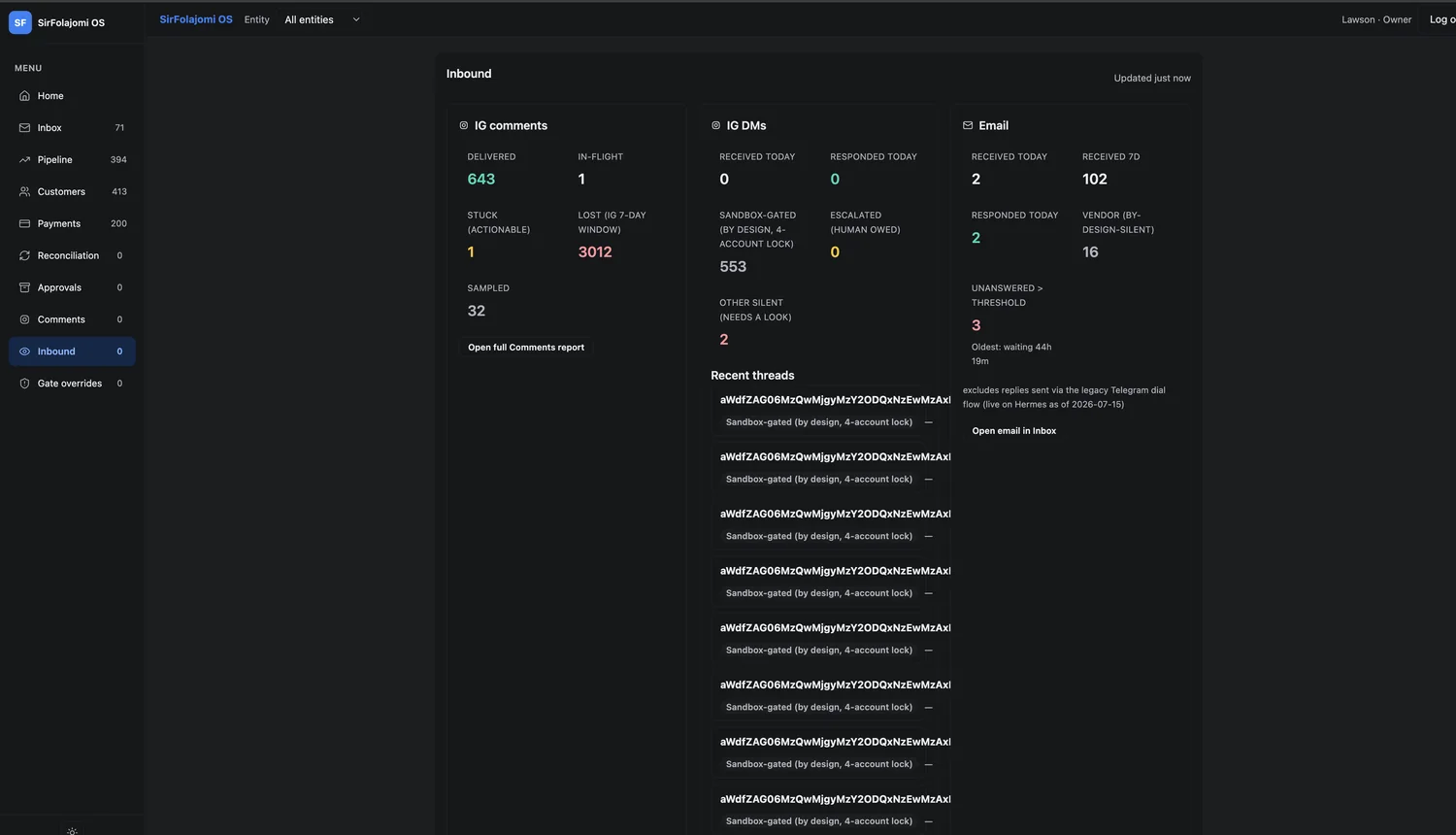
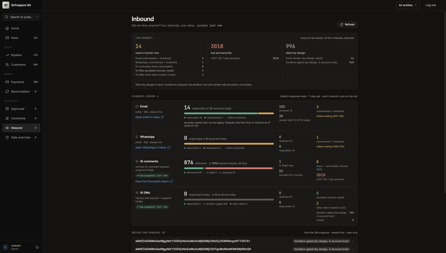
Decision
Lead with the answer, then let the reader audit it
The old screen was three cards of metrics and a list of eight Instagram thread IDs, 64 characters of base64 each, telling you nothing and actionable by nobody. Nothing on it was ranked. Nothing on it was resolved.
The rebuild puts the question in the subtitle (“Did we drop anyone? Four channels, one rollup”) and answers it in three buckets before anything else loads. The channel ledger underneath is the audit trail, so a sceptical owner can walk back from the verdict to the raw figure. I also added WhatsApp, which was live in the business and missing from the console entirely.
Home
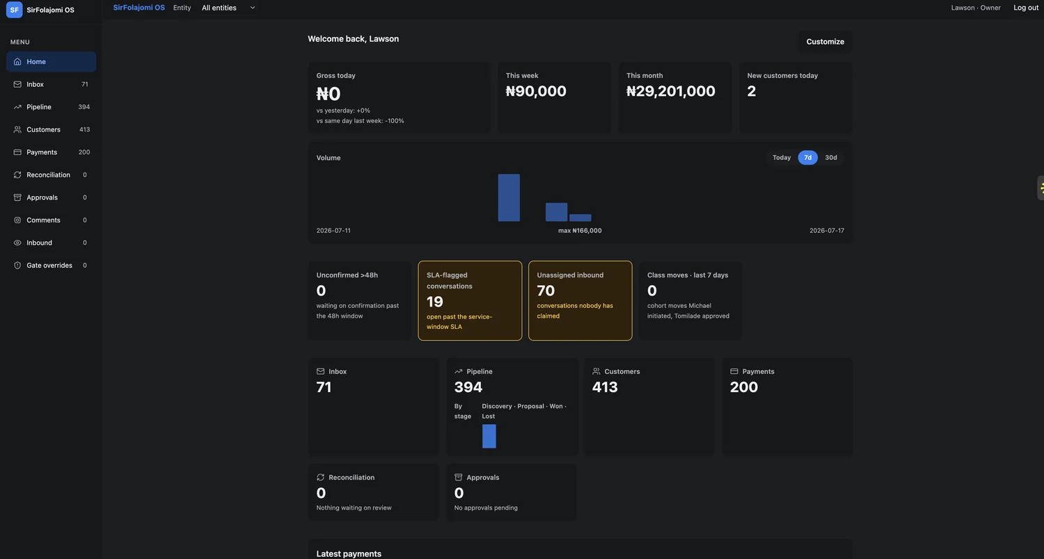
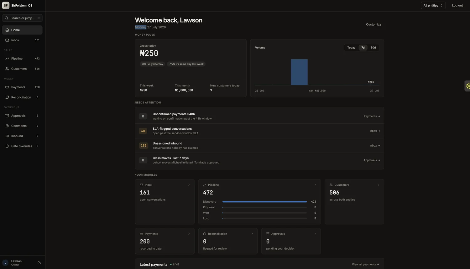
Decision
Sort the page by what the reader can do about it
Ten cards, all the same size and weight. “New customers today” and “Unassigned inbound: 70” looked identical, though one is a pleasantry and the other is seventy people waiting on a human.
Three labelled bands now: money pulse, needs attention, your modules. The alerts became rows, because rows rank and cards don’t, and each one ends in the destination where you fix it.
Inbox
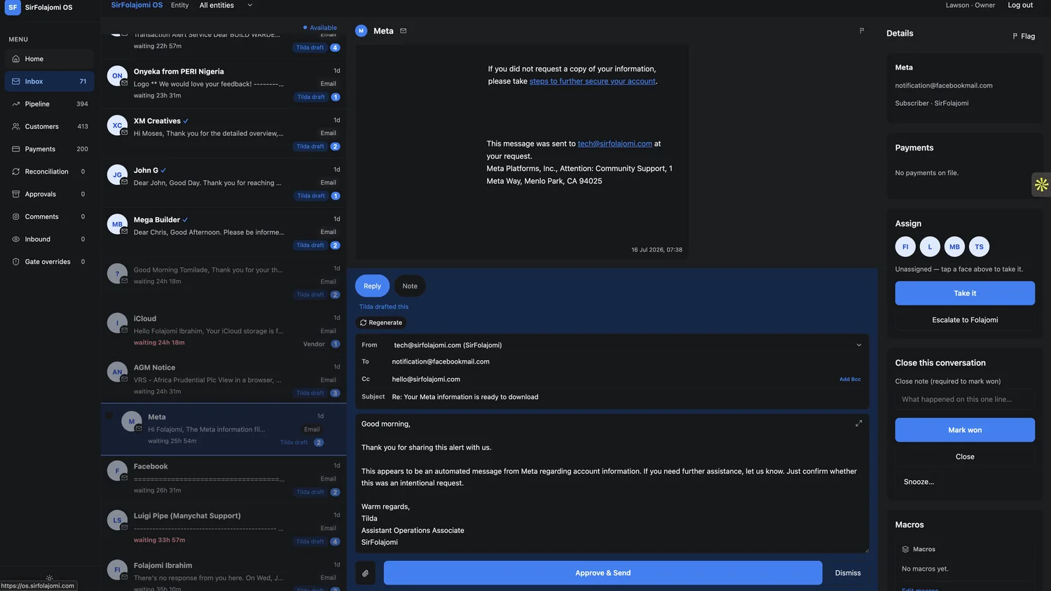
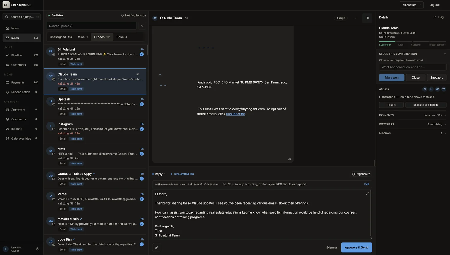
Decision
Collapse everything that is not the message or the draft
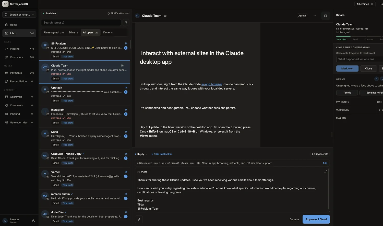
This screen has one job: read what came in, approve or fix what the assistant drafted, send. Before, the composer spent four full rows on addressing fields that are correct 99% of the time, and two of the rail’s six panels existed to announce that nothing exists.
Addressing collapsed to a single line with an edit affordance, and every rail panel to one row carrying its count. The list gained counted filters, which turned the queue into something you can divide up, and a lifecycle rail (subscriber, lead, customer, repeat) that the console had no way to show before.
More screens
Still open
What I would do in the next pass
Finish the rollout
Payments and Comments still run on the old logic. Both need the same treatment (window and unit on every figure, silence separated from failure) and until they have it the console contradicts itself at exactly the two places money is discussed.
The pipeline is a business question, not a layout one
472 deals in Discovery and zero anywhere else is not something design can fix. Either the stages do not describe how the business actually sells, or the pipeline genuinely is not moving. The rebuild made the question unavoidable; answering it is the client’s.
The token system has no enforcement
The rules live in the tokens and in my head. Nothing stops the next generated screen from using rose decoratively, and the whole argument of this project is that consistency has to be checkable rather than remembered.
Ten screens that ran, rebuilt into ten screens that argue for something. The system is the deliverable; the screens are just where you can see it.