Case study · 02 / SoftSuite HR
Redesigning enterprise HR, then shipping it
Subscription decisions took admins five minutes of manual arithmetic and a support ticket. Surfacing cost per user upfront made subscription health readable at a glance. Two years later the argument became a product: the full platform rebuilt on one token set, 78 routes, with an assistant that answers from workspace data instead of guessing.
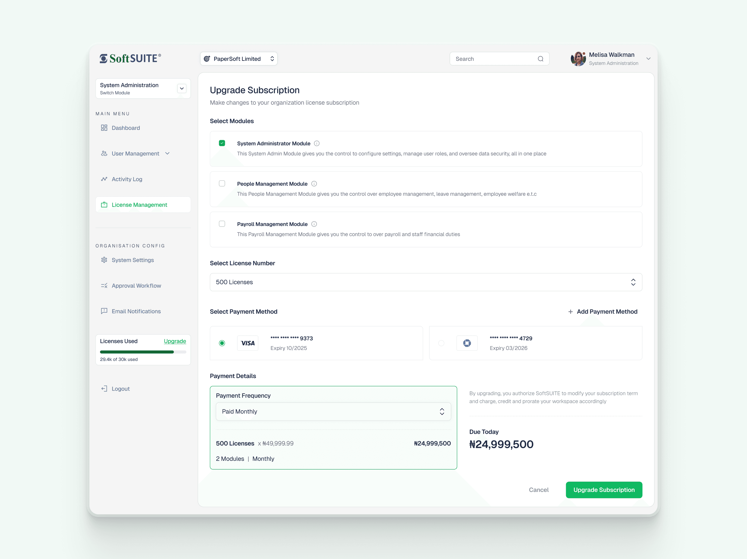
Add a module, change the license count.
Upgrade Subscription
PaperSoft Limited · 470 staff on the system
Licences
500
470 of 500 seats used · 94%
Payment frequency
Cost per user / month
₦4,500
- System Administrator₦4,500
- × 500 licences ₦2,250,000
Due today
₦2,250,000
Prorated from today · renews 12 Jan 2026
The slice above is coded into this page. The full build is at soft-suite.vercel.app.
- Year
- 2026
- Role
- Enterprise Design, Design System, Front-end Build
- Client
- SoftSUITE, an enterprise HR platform
- Users
- 500+ admins, orgs of 50–5,000 staff
- Designed
- 2024, subscription and licence management
- Built
- 2026, 78 routes across 4 modules, live
- Outcome
- 5+ min → glanceable, to price a subscription change
The short version
Enterprise software is allowed to be complex. It is not allowed to make you do the arithmetic.
- Admins priced a subscription change with 5+ minutes of manual arithmetic and, often, a support ticket.
- The redesign puts cost per user and licence headroom on the surface: the interface does the arithmetic, the admin does the deciding.
- Pricing became glanceable, and subscription health became a state you can read instead of a report you compile.
- Designed in 2024. Built by me in 2026: 78 routes across 4 modules, live.
What was wrong
What the old experience made people do
01
The price of a decision was hidden inside it
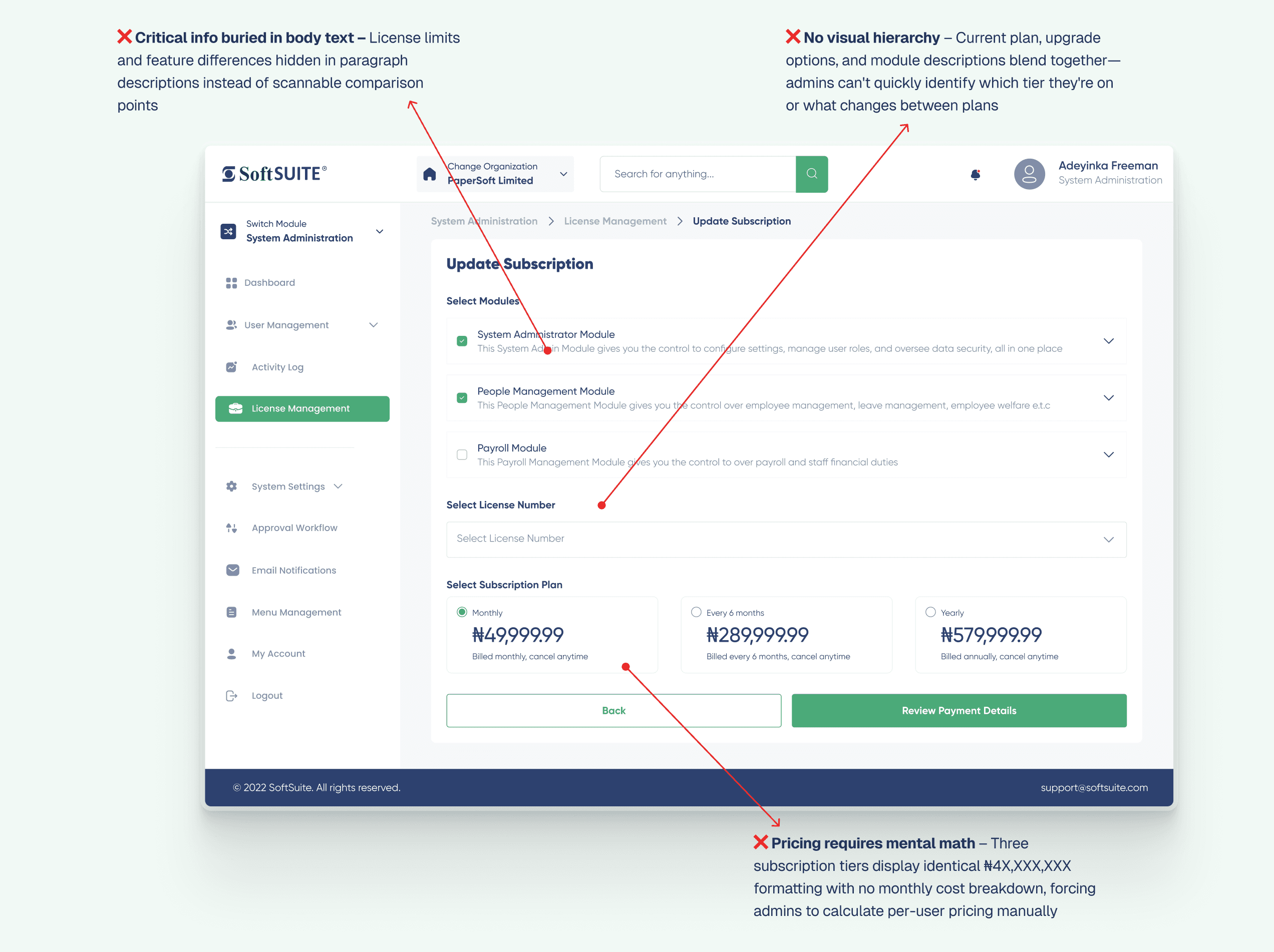
Three tiers displayed as totals with no monthly cost per user, and the differences between them written into paragraph descriptions rather than laid out to compare. Choosing a plan meant doing arithmetic first and guessing second, roughly 5 minutes of it, per the support load.
Fixed by leading with cost per user per month, and keeping a running total live while the choices are still being made.
02
Utilisation had to be interpreted, not read
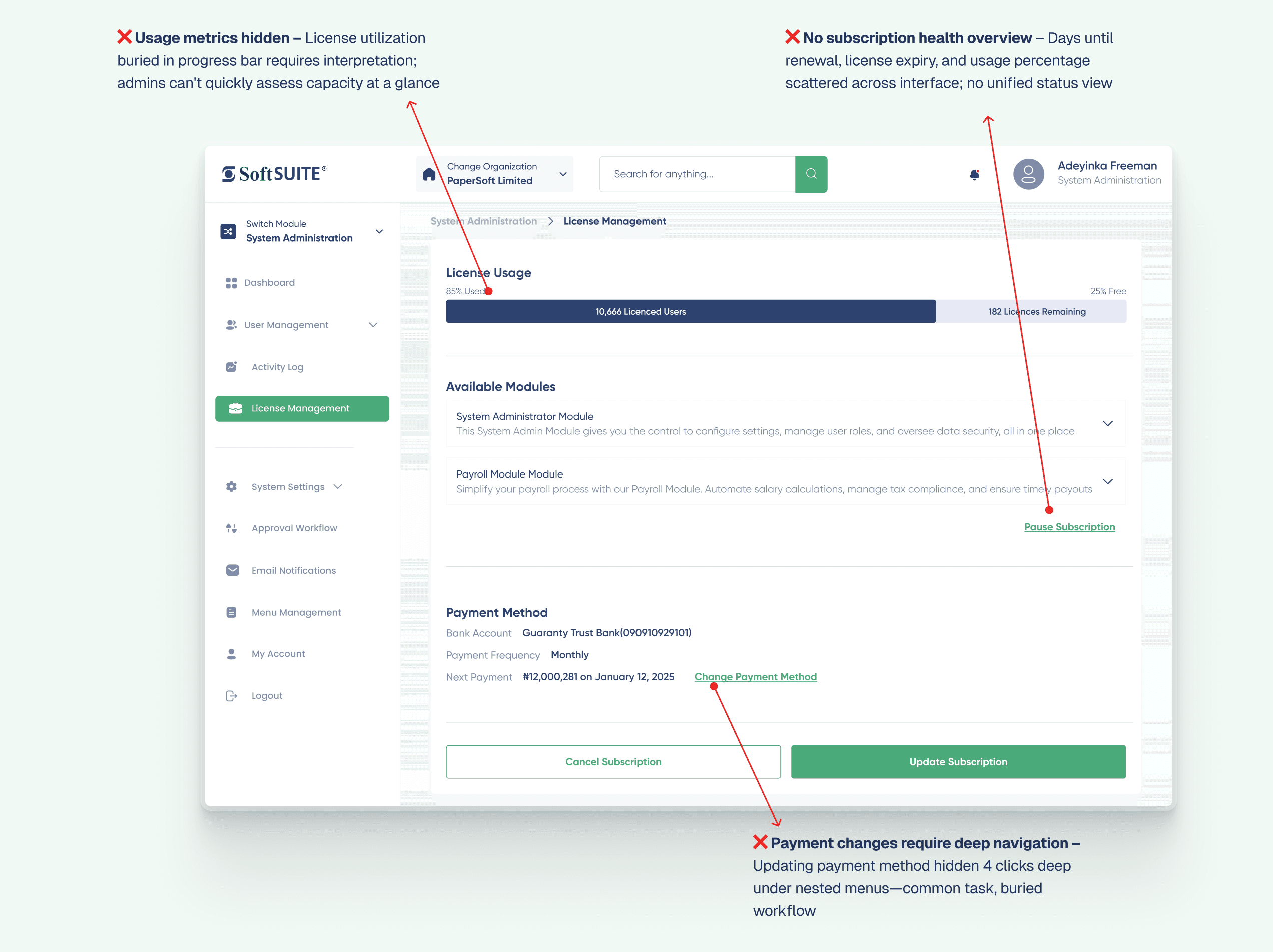
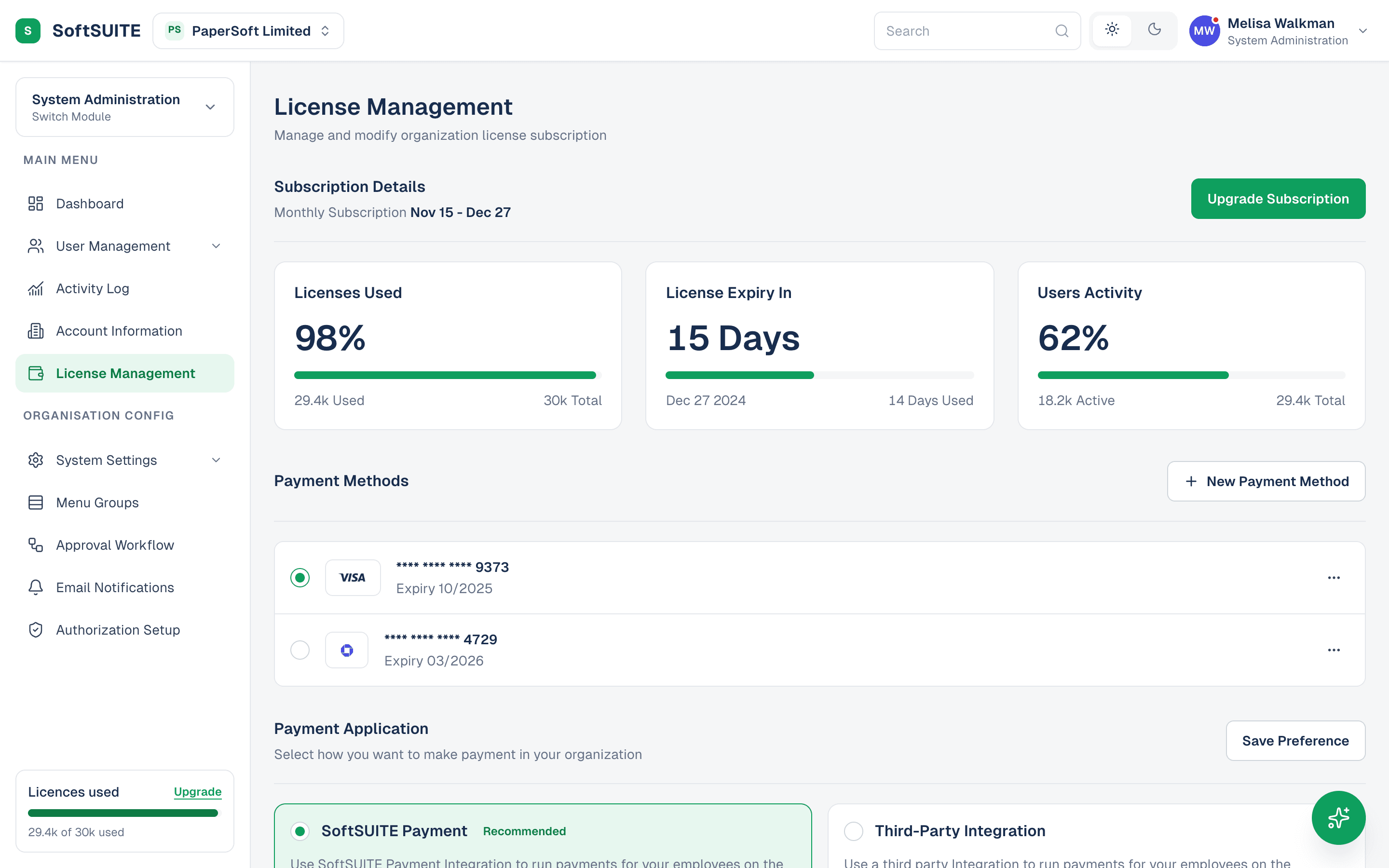
Licence usage sat in a bare progress bar with no figure attached, while renewal date, expiry and activity were scattered across the page. Answering “are we about to run out of seats” meant opening three screens and holding the answers in your head.
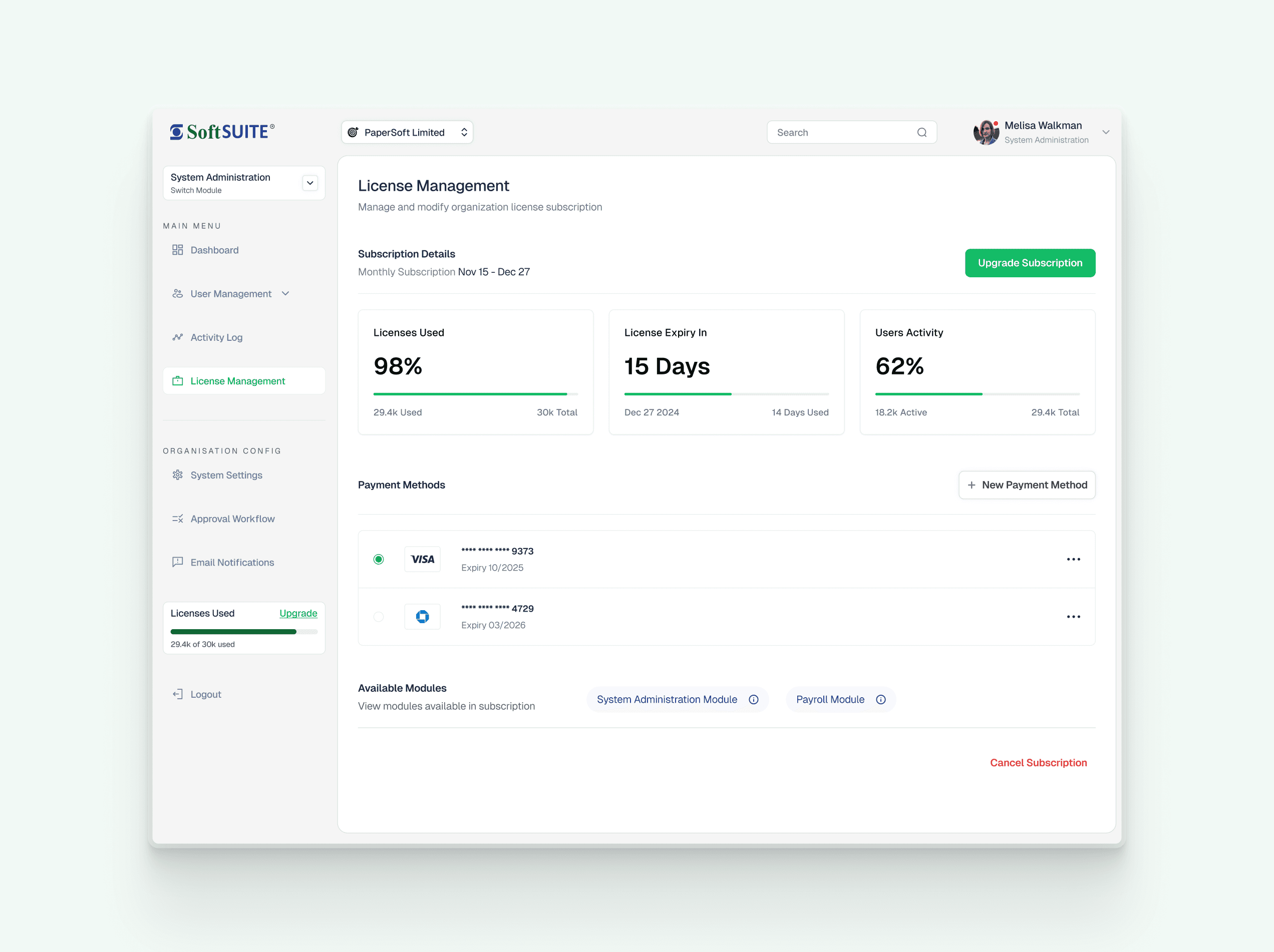
Fixed by three stat cards carrying the figures the page is actually opened for, each with its own unit and window underneath.
03
Routine jobs were buried in a settings maze
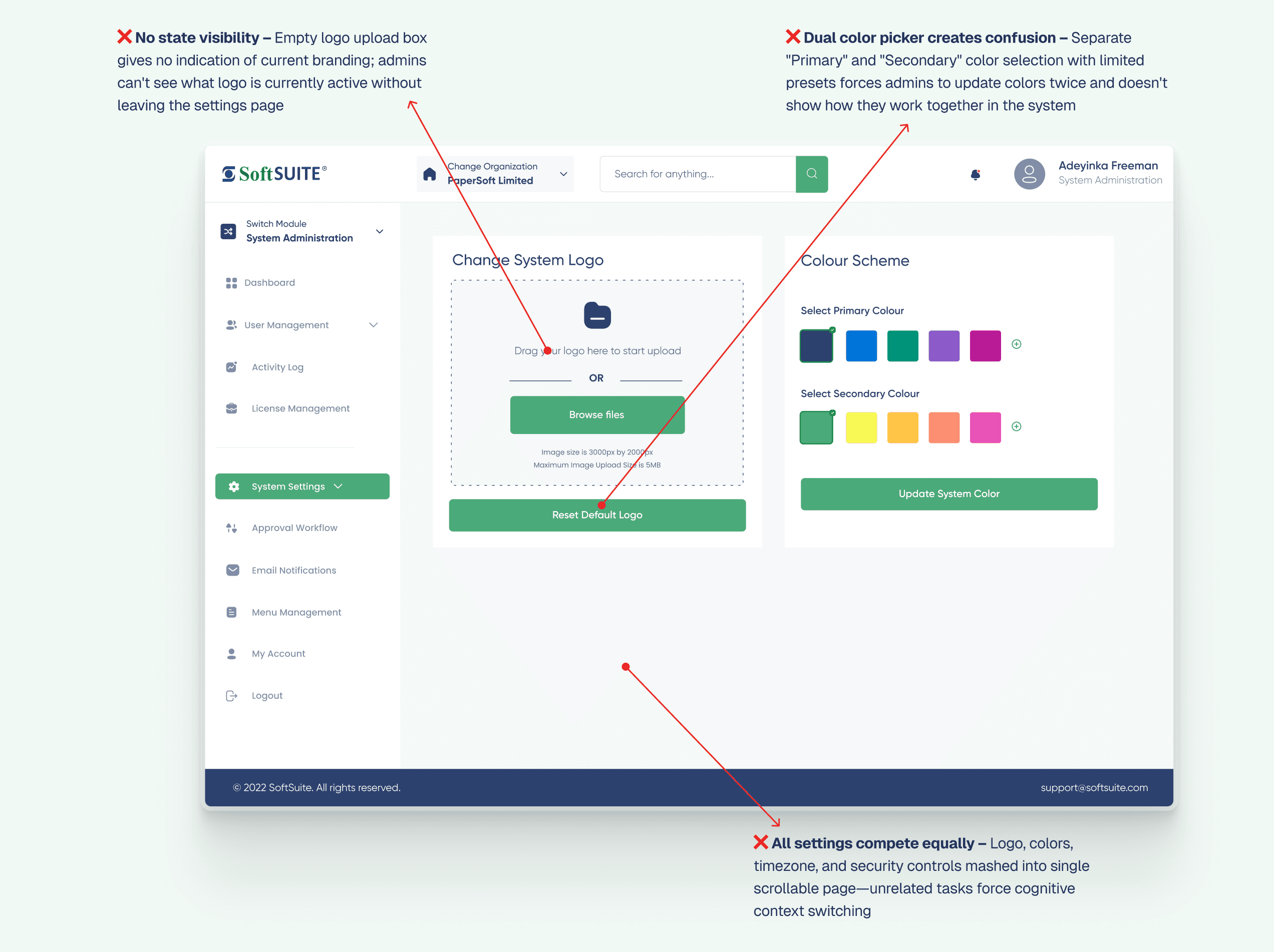
Changing a company logo meant scrolling past colour pickers, timezone and security controls, with 20+ unrelated fields competing equally on one page. The upload box never showed which logo was currently live, so you could not even confirm you had succeeded.
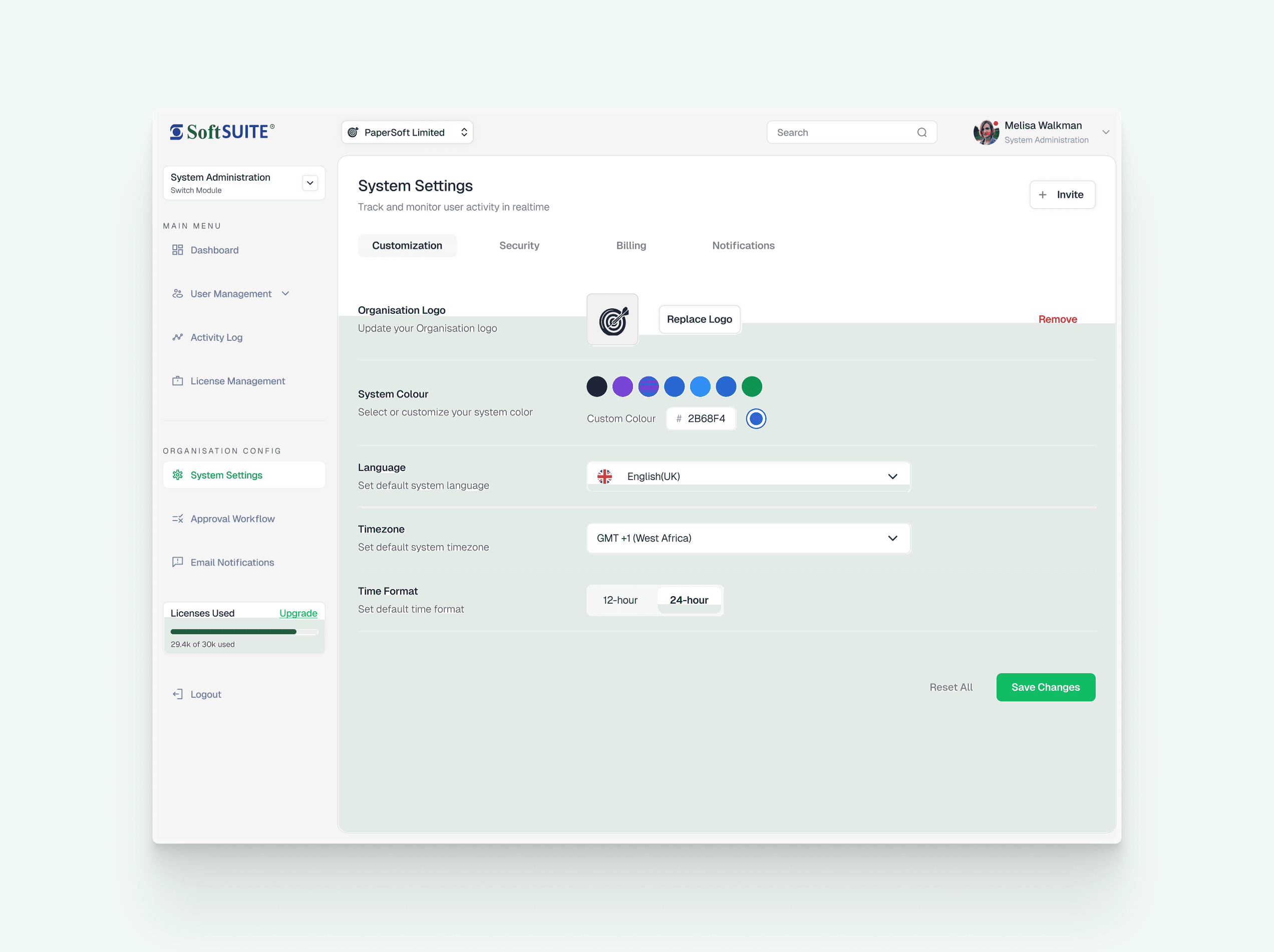
Fixed by separating unrelated jobs into their own tabs, and putting the current logo inside the control that replaces it.
04
Every routine task generated a support ticket
An interface that needs training is a cost that recurs for every new admin, at 500+ of them and rising. The tickets were not evidence of unusual users; they were the interface working exactly as designed.
Fixed by moving the answer to where the question is asked, so the common tasks stop requiring the knowledge that a ticket was buying.
The context
Software that assumed you had been trained on it
500+ admins running multi-module subscriptions for organisations of 50–5,000 staff.
The interface was not broken. Every capability an administrator needed was present and worked, which is exactly why the problem had survived: nothing on a feature list was missing, so nothing showed up as a defect.
What it cost was measured elsewhere: in onboarding time for each new admin, in support tickets for tasks that should have been self-evident, and in the number of screens between a question and its answer.
Enterprise software is allowed to be complex. It is not allowed to make you do the arithmetic.
The challenge
Surface what matters without removing anything
The obvious move with an overloaded enterprise tool is to simplify by subtraction, and it is usually unavailable: every field belongs to somebody’s workflow, and the admin who needs the obscure one needs it badly.
So the constraint was to keep the whole surface area and change only what the interface leads with, which turns the problem from what to remove into what to answer first.
The solution
Answer first, then let the detail sit underneath
The hierarchy now leads with the figure the page exists to produce: cost per user, seats remaining, days to renewal. The supporting detail did not go anywhere. It sits below the answer instead of in place of it.
The multi-step flows collapsed the same way. A routine task is a contextual action inside the view that raised it, rather than a journey into settings, and the running total updates while the decision is being made rather than after it.
The build
Two years later, the design became the product
277 legacy screen families, rebuilt as 78 routes across four modules on one token set, and deployed.
A redesign argued in mockups has a ceiling: every claim it makes is a claim about screens nobody can click. In 2026 the platform was rebuilt end to end (System Administration, Payroll, HR and Self-Service) with Claude Code as the pair, working from the legacy product’s own wiring: the flows were extracted from the Figma prototype’s interaction graph, so the rebuild inherited what the old product actually did rather than what anyone remembered it doing.
The first deliverable was an order of truth, because a rebuild with three sources of visual authority relitigates every screen. New-design exports win, the design system settles what they don’t cover, and the legacy file defines features, never visuals. Once that was written down, arguments about how a screen should look stopped being arguments about whose screenshot was newer.
Every screen then passed two review gates before it counted as done: a design-system audit (no raw values, token discipline, button and form rules) and a visual QA pass against the exports. The gates are agents, so the standard is checkable rather than remembered, which is the lesson the SirFolajomi study ends on, applied here at 78 routes of scale.
The assistant
An assistant that reads the workspace instead of guessing
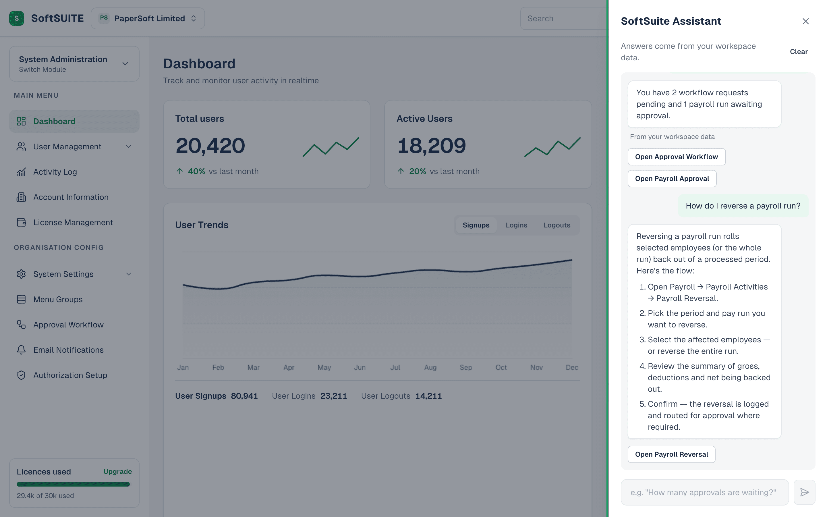
Every module ships with an assistant, reachable from any scroll position. Ask it a question (“How many approvals are waiting?”, “When is the next pay date?”, “How much of the licence is used?”) and it answers with the workspace’s own figures, offers the buttons that take you there, and walks through the flows people used to file tickets about: running payroll, reversing a run, onboarding an employee.
The design decision that matters is where the answers come from. The assistant reads a live snapshot assembled from the same data hooks the screens render from, so it can never disagree with the page behind it; an assistant that contradicts the dashboard it floats over would burn more trust than it earns. And when a slice hasn’t loaded, it says “I can’t see that yet” instead of improvising, because in payroll software a confident wrong number is worse than no answer.
The engine sits behind an interface. What ships today is deterministic: 21 intent rules over the snapshot, no network, no canned figures, and a thinking delay derived from the question itself so the typing indicator reads naturally without ever jittering. A Claude-backed engine implements the same contract and drops in without touching the panel. Shipping the honest floor before the clever ceiling was deliberate: the interaction design, the data contract and the trust rules all get proven on an engine that cannot hallucinate, and the model inherits them.
Decision 01
Pricing that answers the question upfront
Subscription decisions required 5+ minutes of manual calculation and frequent “What’s the difference?” support tickets. The redesign leads with monthly cost per user, so the comparison is already made by the time the admin arrives.
Decision 02
Traffic-light subscription health
A simple color system lets an admin judge the state of a subscription without reading a single number: the check that used to require opening three screens.
Decision 03
Routine tasks, out of the settings maze
Simple tasks like “change company logo” required navigating through 20+ unrelated form fields. Task-based navigation pulls them into the primary view.
Decision 04
An order of truth, so screens stop being relitigated
Three visual authorities existed: new exports, the design system, and the legacy Figma. Ranking them (exports, then system, with legacy defining features and never visuals) ended every “which screenshot wins” argument before it started.
Decision 05
Sixty success modals became toasts
The legacy product confirmed nearly every action with a blocking modal: 60+ frames of “Successful!” with a button to dismiss. Results of completed actions became toasts; the only modals that survived are the ones carrying a copyable receipt or reference, because those genuinely need to hold the screen.
Decision 06
The assistant answers from the page’s own data
One snapshot, assembled from the same hooks the screens read, is the only thing the engine sees, so the assistant can never contradict the dashboard behind it, and a missing slice produces “I can’t see that yet” rather than a guess.
The design system
The tokens every screen is built from
A semantic-first system for an enterprise workspace: every colour, radius, shadow and duration in the product is a named token, dark mode redefines the set wholesale, and table density is one variable. 78 routes consume it; none of them contain a raw value.
01
Semantic first
Components never touch a raw value. Every property is a role with a name, and the role is the API.
02
Two themes, one contract
Dark mode swaps the token values wholesale. No component knows which theme it is in.
03
One primary per view
The commit action is findable because nothing else competes with it. Never two fills side by side.
04
Density is a token
Tables switch between compact and comfortable through one variable: a preference, not a redesign.
SoftSuite
Two tiers. The ramps are raw values that no component is allowed to reference; the tokens beneath name a role and point at one. Select a token to see which step it resolves to.
slate the neutral spine, text through surfaces
strong
body
muted
placeholder
border-strong
border
field
hover
surface
green the one accent
active
deep
hover
base
soft
danger destructive, negative
hover
base
soft
warning caution
base
line
soft
info informational
base
line
soft
chart series colours, in their own ramp order
1
2
3
4
5
6
7
Text
Action
Feedback
Dark theme
The screens
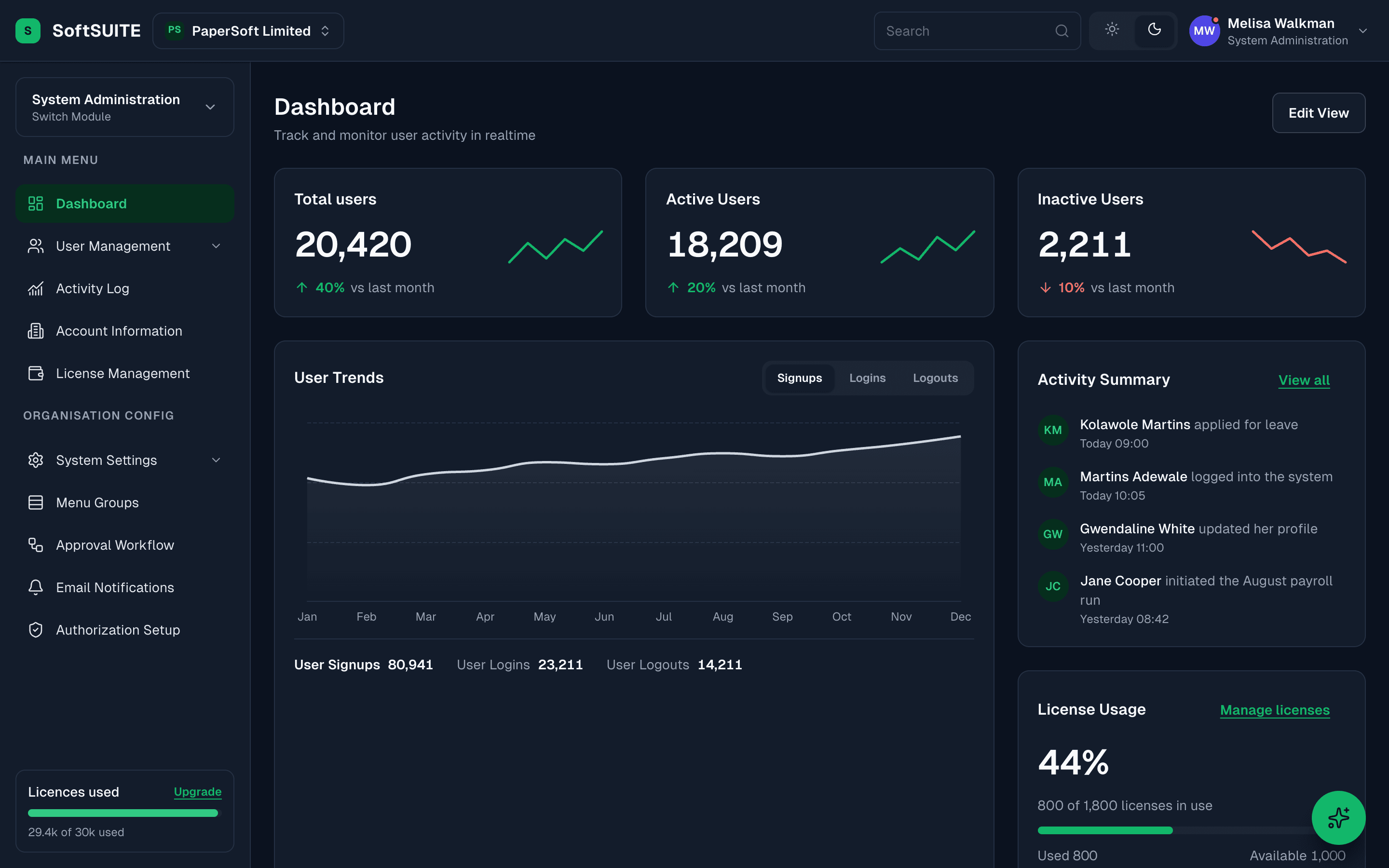
3 surfaces, one decision each
Toggle each pair. The rebuilt screen is the resting state, because it is the one that has to hold up.
Subscription
Decision
Put the cost where the decision is being made
Three tiers displayed as ₦4X,XXX,XXX with no monthly cost per user, and the feature differences written into paragraph descriptions rather than laid out to compare. Choosing a plan meant doing arithmetic first and guessing second.
The rebuild keeps a running total visible while the choices are being made, so the number updates as modules and licences change instead of arriving at the end.
License management
Decision
Make subscription health readable from across the room
Licence utilisation sat in a bare progress bar that had to be interpreted, and renewal date, expiry and usage were scattered across the page with no single status view.
Three stat cards now carry the figures an admin actually opens this page for, each with its own unit and window underneath. Payment methods moved up from four clicks deep into the same view.
System settings
Decision
Give each routine task its own surface
Changing a logo meant scrolling past colour pickers, timezone and security controls, all competing equally on a single page, and the upload box never showed which logo was currently live.
Four tabs separate the unrelated jobs, and the current logo sits in the control that replaces it. The task that used to require navigating 20+ fields is now one panel.
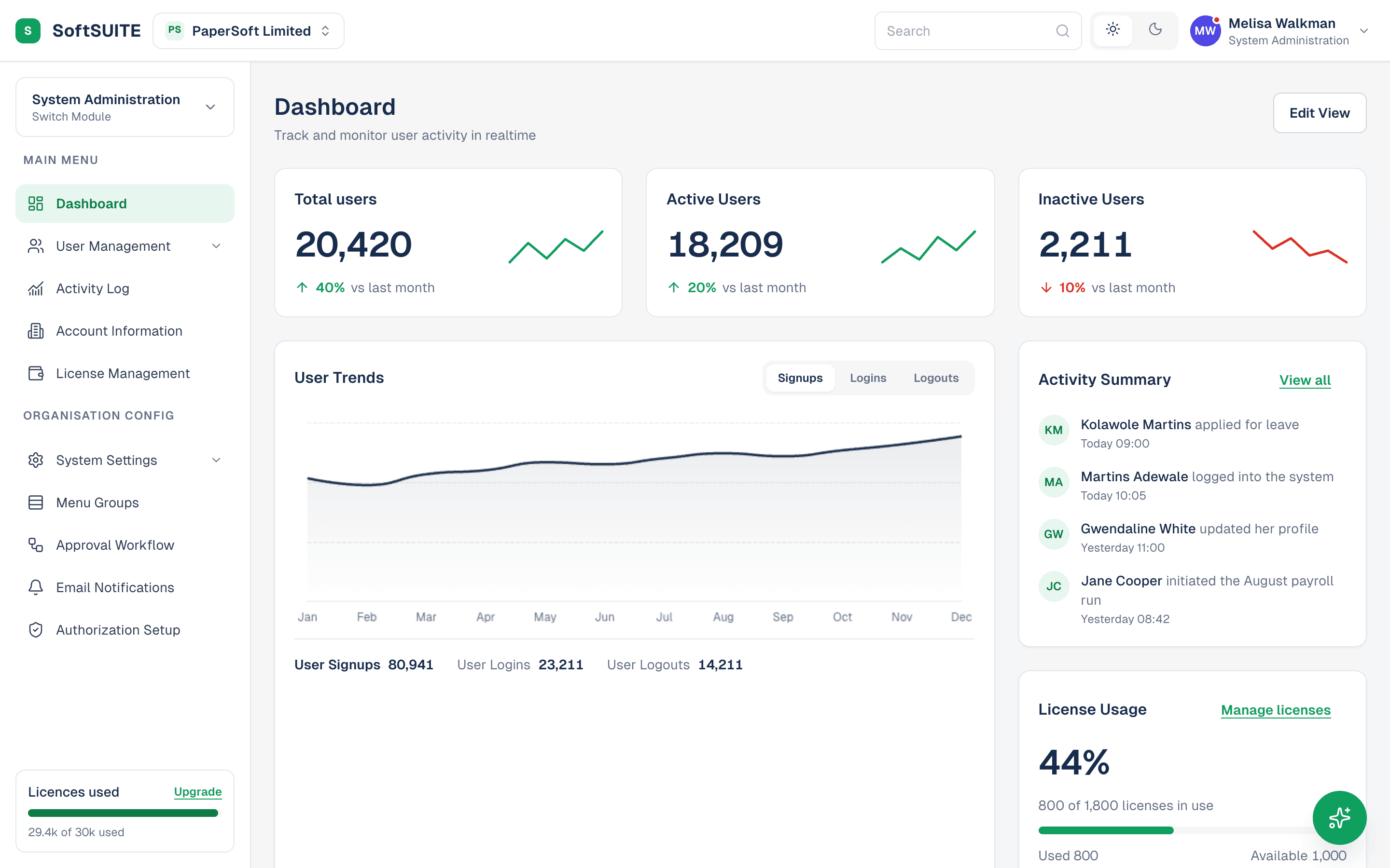
More screens
Still open
What I would do in the next pass
The 2024 claims are still unmeasured
The 5 minutes and the ticket volume came from the client’s account of the old flow, not from instrumentation, and nothing was measured after. The rebuild makes measurement possible, since the flows are real now, but until it happens the redesign is defensible on its reasoning, not on evidence.
The assistant’s ceiling is its rule list
Twenty-one intents cover the questions admins actually file tickets about, and anything phrased outside them falls through to a polite miss. The engine interface exists precisely so a Claude-backed engine can replace the rules. That swap is the obvious next pass, and the panel is already built not to notice it.
Permissions are still assumed, not designed
Who is allowed to change a subscription is a subscription question. Both the 2024 flow and the rebuilt one assume every admin looking at the button may press it. Authorization setup exists as a screen, but the flows themselves don’t yet read it.
The 2024 redesign argued the interface should assemble the answer for you. The 2026 build made the argument something you can click.