Case study · 05 / PlantBuddy
Building confidence for plant novices
Plant apps overwhelm beginners with botanical terms and empty dashboards. PlantBuddy removes the decisions instead of adding education: schedules generate themselves, photos replace symptom forms.
Identify a plant, then check today’s tasks.
Add a plant
Point the camera at it. That's the whole setup.
- Year
- 2024
- Role
- Mobile App Design
- Product
- Plant care, iOS
- Scope
- Mobile app design
- Audience
- First-time plant owners
- Outcome
- Zero decisions, asked of a beginner before day one
The short version
A beginner doesn’t need to be taught. They need not to be asked.
- Plant apps greet beginners with botanical quizzes and empty dashboards: a competence test disguised as onboarding.
- PlantBuddy asks zero questions before day one. Schedules generate themselves; a photo replaces the symptom form.
- Designed for the person who has never kept a plant alive and does not want to say so.
What was wrong
What the old experience made people do
01
The setup form asked what only an expert knows
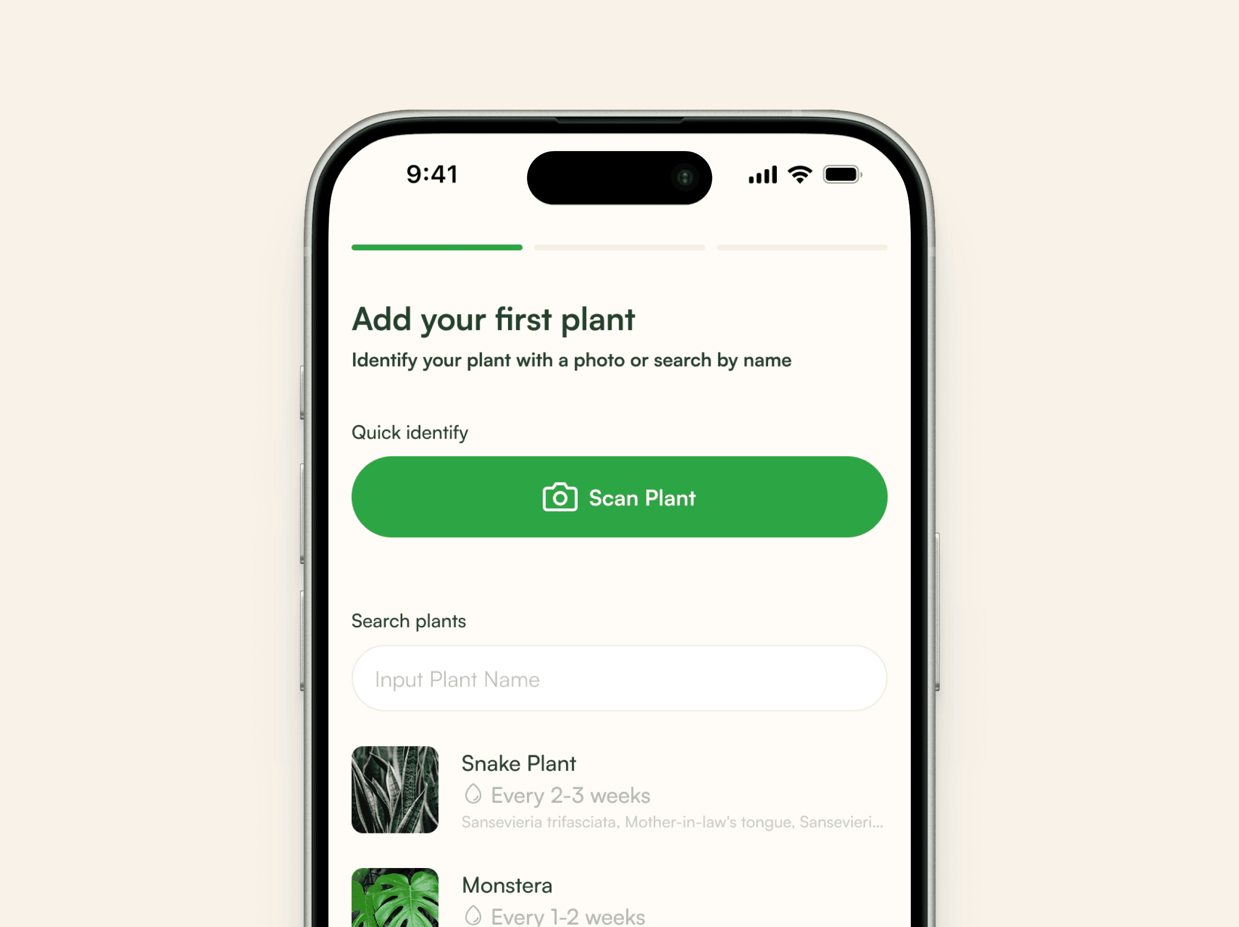
Adding a plant meant answering for species, pot size, soil mix, watering interval, light level and humidity target. That is 6 fields, every one of them a question the beginner downloaded the app to have answered. The form is a competence test disguised as onboarding.
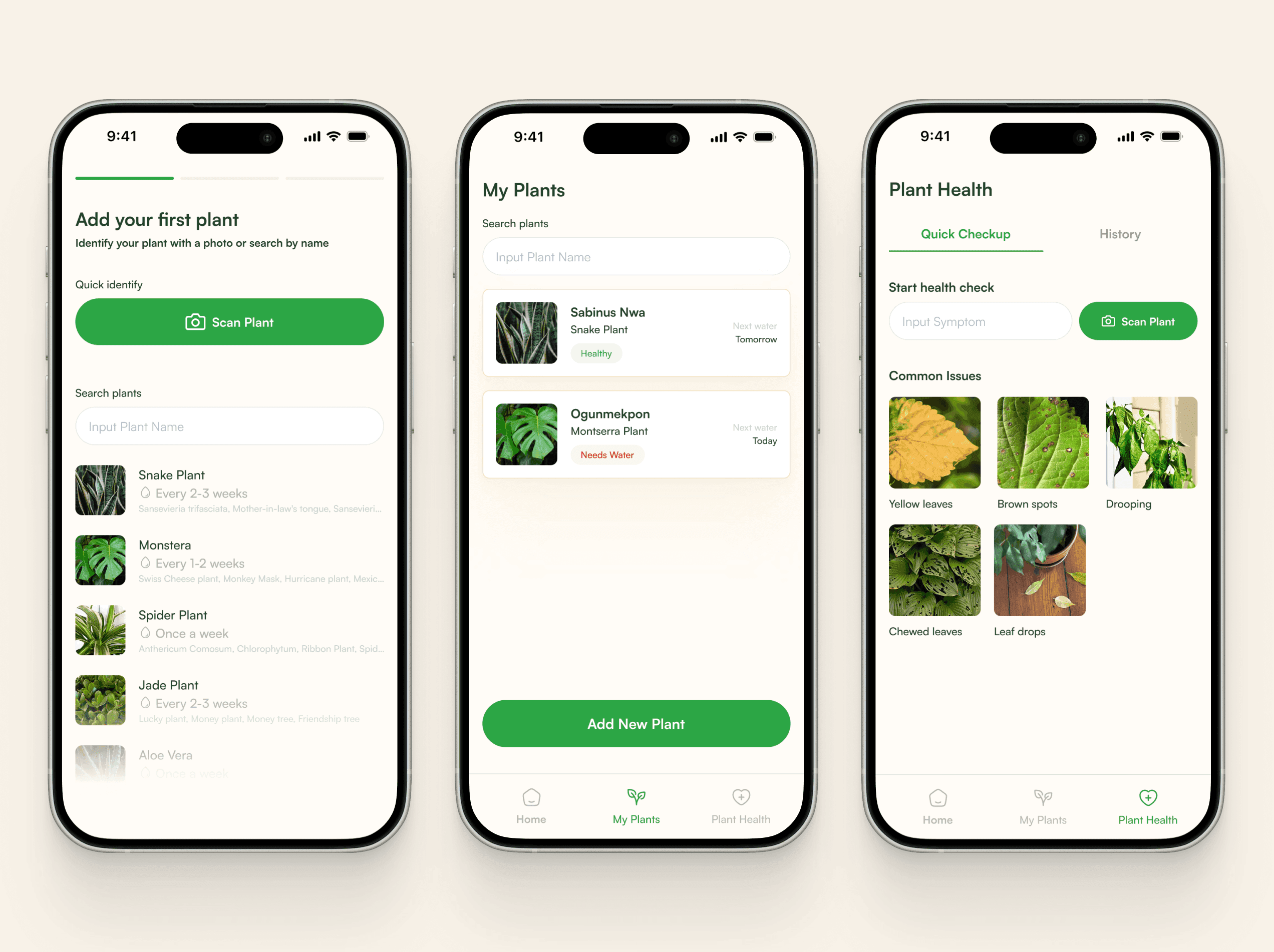
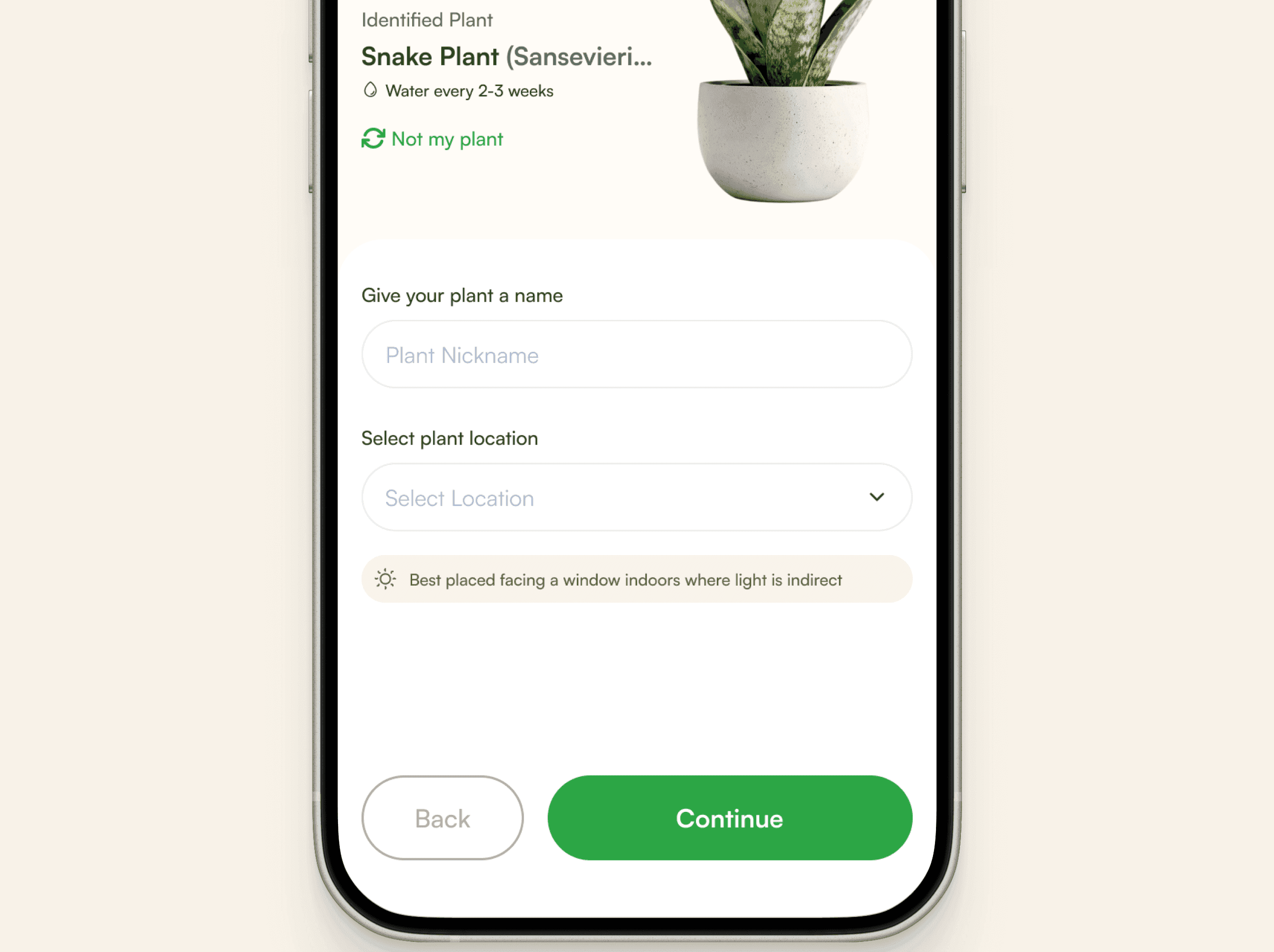
Fixed by inferring all six from the identification. The only things left to type are a nickname and a room.
02
Symptoms had to be named before they could be reported
Health checks were built as a form: describe the problem, pick a category. But naming the thing is the hard part. A novice can see that a leaf has gone yellow at the edges and still have no idea whether that is chlorosis, overwatering, or completely normal for the species.
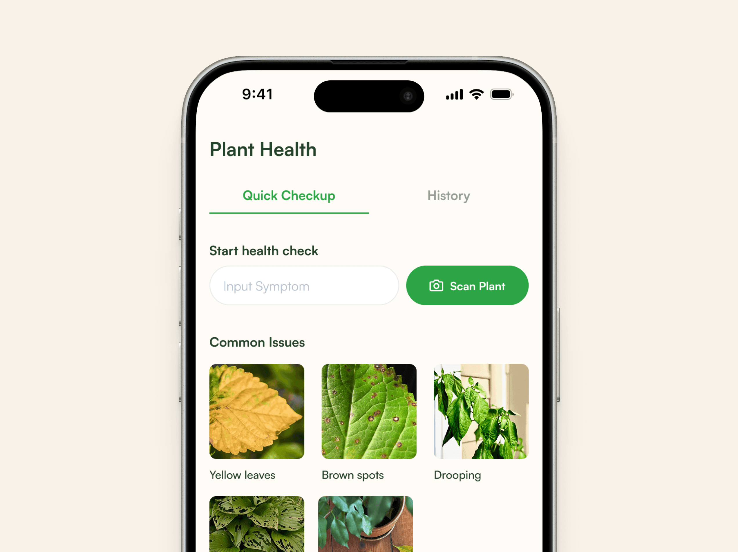
Fixed by making the common issues photographs rather than vocabulary. Matching a picture is something a beginner can do; naming a condition is not.
03
The dashboard was empty exactly when reassurance was needed
Day one is a blank grid, and blankness reads as failure; the user assumes they have missed a setup step. It is also the day the habit either forms or does not, which makes it the worst possible moment for the app to have nothing to say.
Fixed by showing only what is actionable now, so an empty list means the day is finished rather than the app is unconfigured.
04
Care advice was written for people who already garden
“Bright indirect light” is precise, correct, and useless to someone standing in their own living room trying to decide which windowsill that means.
Fixed by attaching the placement to the advice (near a window, out of the sun) so the instruction resolves to an actual spot in an actual room.
The problem
Plant apps ask beginners to already be good at plants
Every question in the setup flow is one the user came to have answered.
The category is full of capable products that assume a competent owner: botanical names, configurable schedules, symptom taxonomies, dashboards waiting to be filled. Each of those is a reasonable feature and a reasonable thing to want, later.
For someone on their first plant, they are all the same obstacle. The app keeps asking for judgements the user does not yet have, and every one of them is a place to stop, feel out of their depth, and close it.
A beginner doesn’t need to be taught. They need not to be asked.
The insight
It reads as an education gap. It is a decision problem
The obvious response is to teach: tooltips, a glossary, a friendly explainer on chlorosis. That answer is wrong in an interesting way: it accepts that the user must supply the judgement, and merely tries to qualify them faster.
What actually stops people is not that they do not know. It is being made to decide while not knowing, repeatedly, before they have any evidence that they can keep the thing alive. Remove the decisions and the knowledge stops being a prerequisite. It can arrive later, once there is a plant worth learning about.
The solution
Take the decisions away, not the information
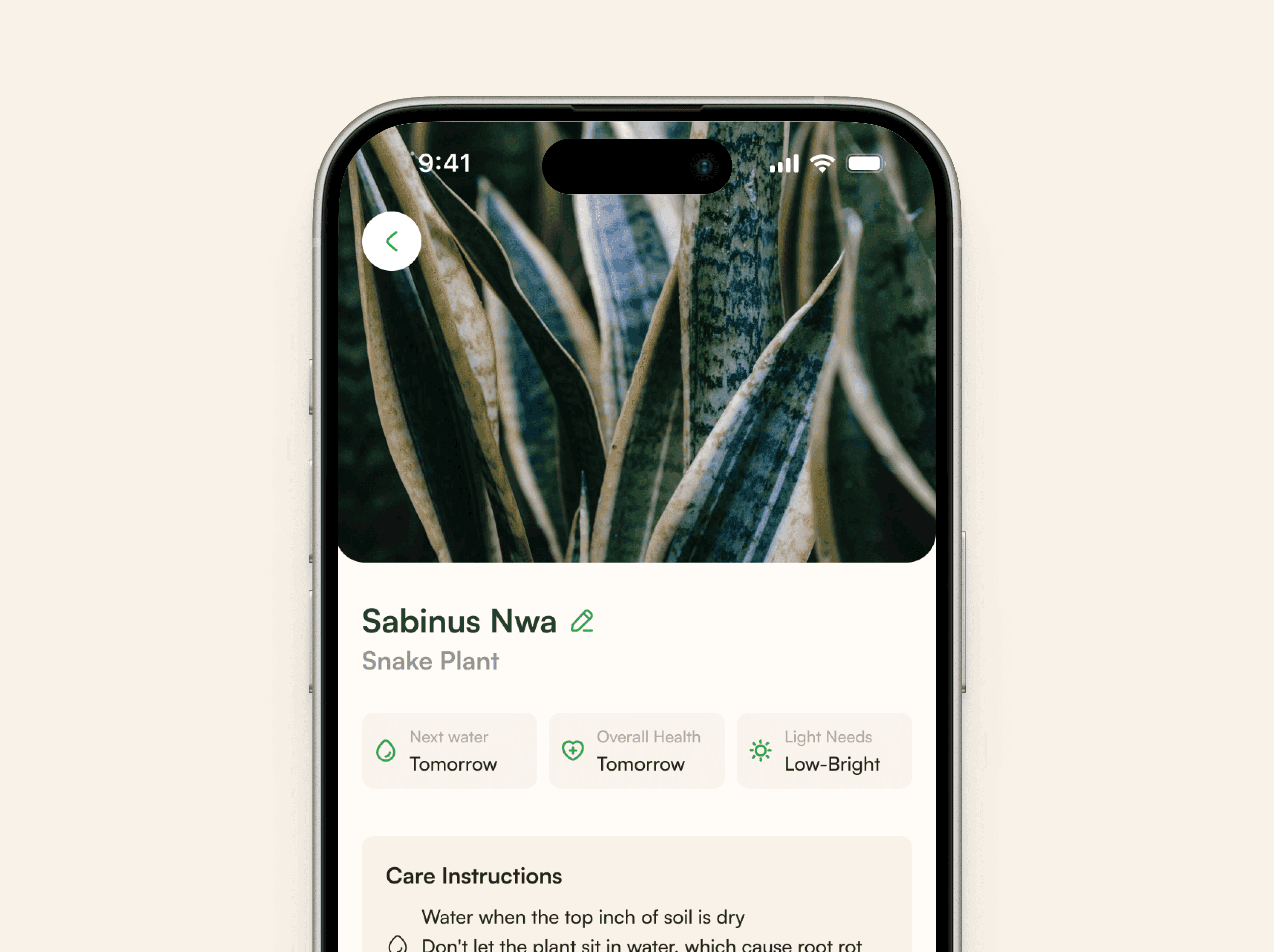
Identification is the single input. Everything downstream (watering cadence, light guidance, the first watering date) is derived from the species rather than requested from the user, so the count of questions asked before day one is zero.
The information is all still there. It sits underneath the answer, for the moment the user gets curious rather than the moment they are trying to get started. That ordering is the whole design: answer first, reasoning second, vocabulary last.
Decision 01
The schedule writes itself
Identifying a Snake Plant is enough to produce the whole regime: water every 2–3 weeks, bright indirect light, first watering on Tuesday. The demo above keeps a running count of questions asked, and it stays at 0, because every field the old form demanded is inferable from the species.
Decision 02
A photograph instead of a form
The health check leads with pictures of the common failures (yellow leaves, brown spots, drooping) and asks the user to match rather than describe. It moves the hard step from the person who cannot do it to the system that can.
Decision 03
An empty list is a finished day
The daily view shows what is actionable now and nothing else. That makes emptiness a success state rather than a configuration failure, which matters most in the first week when there is genuinely almost nothing to do.
More screens
Still open
What I would do in the next pass
Identification has no honest failure state
The whole design rests on one input being right, and the flow currently assumes it is. There is a “not my plant” correction, but no design for low confidence, for a species outside the set, or for a photo too poor to read, which is the case that will hit hardest, because it hits on day one.
Nothing has been designed for the plant dying
Beginners lose plants. It is the most emotionally loaded moment the product has and there is no screen for it. Handled badly it confirms exactly the fear the app was built to remove; handled well it is probably the single strongest retention moment available.
The health check is triage, not diagnosis
Matching a photograph narrows the possibilities; it does not settle them. Yellow leaves have several causes and the current flow does not distinguish them, so the advice has to stay general, and general advice is where the category started.
The temptation with a novice audience is to explain more. Almost every decision here went the other way: ask less, infer harder, and keep the explanation for the moment somebody wants it.