Case study · 04 / Koordinar
Simplifying group travel planning
Group trips die in the planning phase. Koordinar keeps voting, dates and destination intel inside the trip itself, so decisions happen where the context already lives.
Shift the dates, then cast a vote.
Indian Trip
In progressDelhi, India · December 02 – December 11, 2025
7 travellers
Destination information updates automatically when the dates move
Public holidays in India
No public holidays fall inside these dates.
Weather forecast
Tue, Dec 02
24°
Haze
Wed, Dec 03
23°
Haze
Thu, Dec 04
22°
Sunny
Fri, Dec 05
21°
Sunny
Sat, Dec 06
19°
Haze
Sun, Dec 07
20°
Sunny
- Year
- 2025
- Role
- Product Design, Logo Design
- Product
- Group travel planning, web
- Scope
- Product design, logo and wordmark
- Starting point
- A named problem and no product
- Outcome
- 12 chats → 1, places the group has to look
The short version
A group doesn’t need another planning tool. It needs the decision and the context on one screen.
- Group trips die in 12 chats spread across four apps. Koordinar is the one place the group has to look.
- Voting, dates and destination intel live inside the trip itself, so decisions happen where the context already is.
- Identity included: the logo, the wordmark and the product, from a named problem and no existing product.
What was wrong
What the old experience made people do
01
The decision and its context lived in different apps
A poll tool knows the options and nothing else. It cannot tell you that the person who just voted for the 7am hike is the one who lands at midnight, or that the date everyone picked has already moved twice. So the vote gets cast, then re-litigated in the chat by people who have the context the poll was missing.
Fixed by putting the ballot inside the trip. You vote on the same screen that shows the itinerary, the dates and who has confirmed.
02
Nobody could tell who had actually committed
“Is Alex in?” is the question that stalls a trip. A thumbs-up in a chat is not a commitment, and a group of 8 has no shared place to see the difference between someone who agreed, someone who is thinking, and someone who never opened the message.
Fixed by making confirmation a state on the trip rather than a message in a thread: visible to everyone, in one place, at a glance.
03
Destination intel went stale the moment dates moved
Weather and holidays get checked once, screenshotted, and pasted into the chat. Then the dates shift by three months and the screenshot is worse than nothing: it is confidently wrong, and it is the most recent thing anyone in the group has seen.
Fixed by deriving the forecast and the public holidays from the trip dates, so moving the trip moves them too. Nothing is a screenshot.
04
The first useful thing was behind a sign-up
Planning is a group act, and the person who starts it is usually selling the idea to everyone else. If the link they share opens on an account wall, the pitch dies there. The rest of the group never sees the thing being proposed.
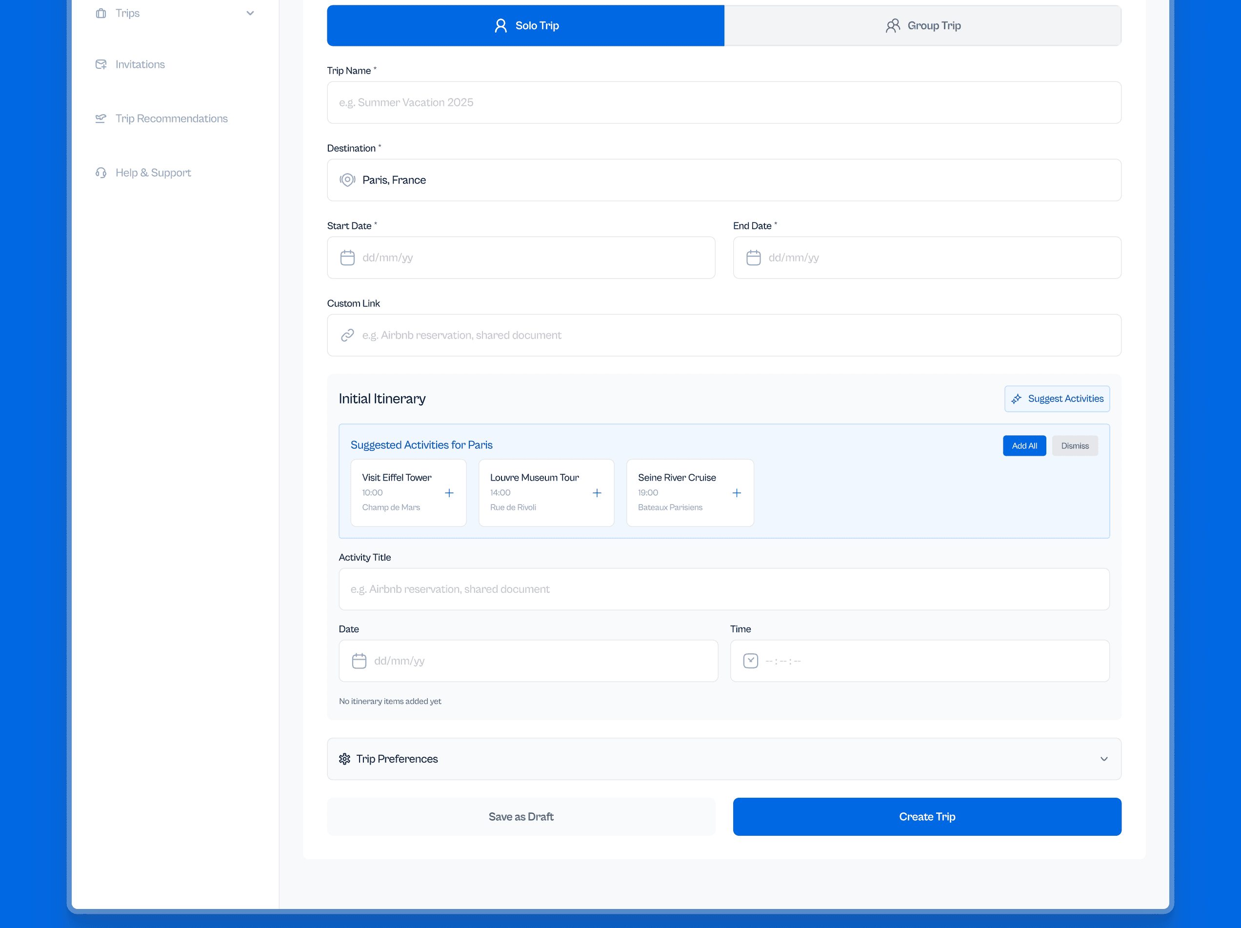
Fixed by putting a working planner in the landing page itself. Destination, dates and trip type all function before there is an account.
The problem
Group trips die in the planning phase
Eight people, a dozen threads, and a decision nobody can find twice.
The failure is never enthusiasm. Everybody wants to go. What collapses is the coordination: votes tracked in someone’s Notes app, weather forwarded as a screenshot, dates agreed in a thread that scrolled past, and no single answer to who has actually committed.
Each of those tools is fine on its own. The cost is the seams between them. Every seam is a place where the group’s shared picture of the trip can quietly diverge, and by the time anyone notices, the flights have gone up.
A group doesn’t need another planning tool. It needs the decision and the context on one screen.
The insight
The tools weren’t missing features. They were missing each other
It is tempting to read this as a gap in functionality, and to answer it with a better poll or a smarter calendar. That was the wrong read. Every capability a group needs already exists somewhere; what does not exist is a place where they sit together.
So the design problem was not “what else should this do”. It was “what has to be on the same screen as what”, and everything after that followed from answering it.
The solution
One surface, and everything contextual to it
The trip is the object. Votes resolve inside it, so a decision is made where its consequences are visible. Destination intel is derived from it, so moving the dates moves the forecast and the holiday flags with them. Activities are suggested from the destination, so nobody has to start planning from an empty page.
None of that is a feature the group asked for. It is the same set of jobs they were already doing across a dozen tools, collapsed onto one surface so the seams have nowhere to open.
Decision 01
Voting lives in the trip
A standalone poll isolates the decision from everything needed to make it. Here, someone voting on breakfast can see the itinerary around it, who has confirmed, and what else is already booked that morning. The context is not a click away; it is the page the ballot is printed on.
Decision 02
Destination intel is derived, never entered
Dates are the input and everything downstream recomputes from them. Shift a trip from December to March and the forecast moves from 24° and hazy to 31° and sunny, and Holi appears inside the window on Wed, Mar 04, surfaced because the dates moved, not because anyone remembered to look.
Decision 03
The landing page is the product
The hero carries a working planner rather than a picture of one. Destination, dates and trip type all do something before an account exists, because the person sharing the link is pitching a trip and the pitch has to survive first contact.
More screens
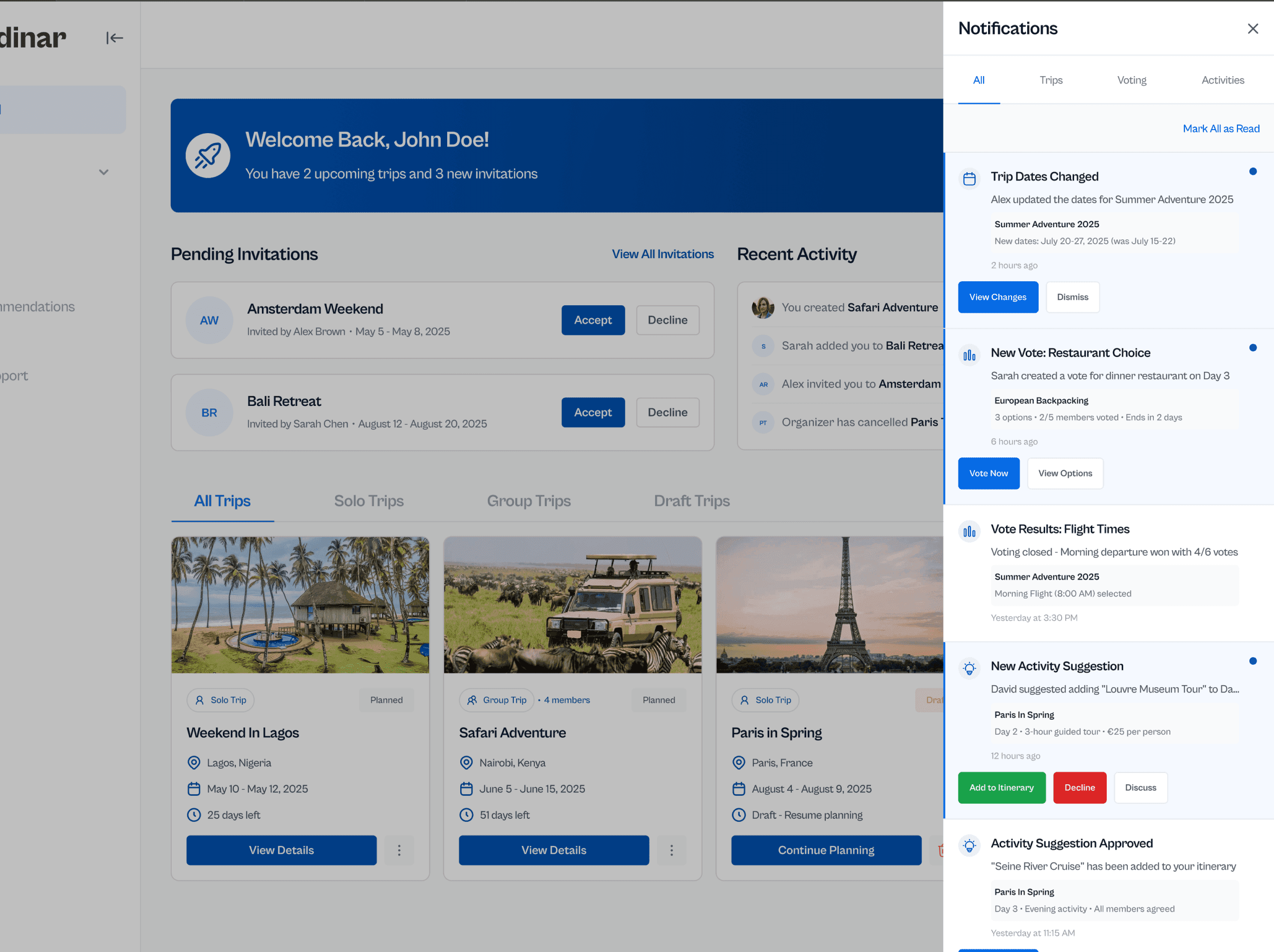
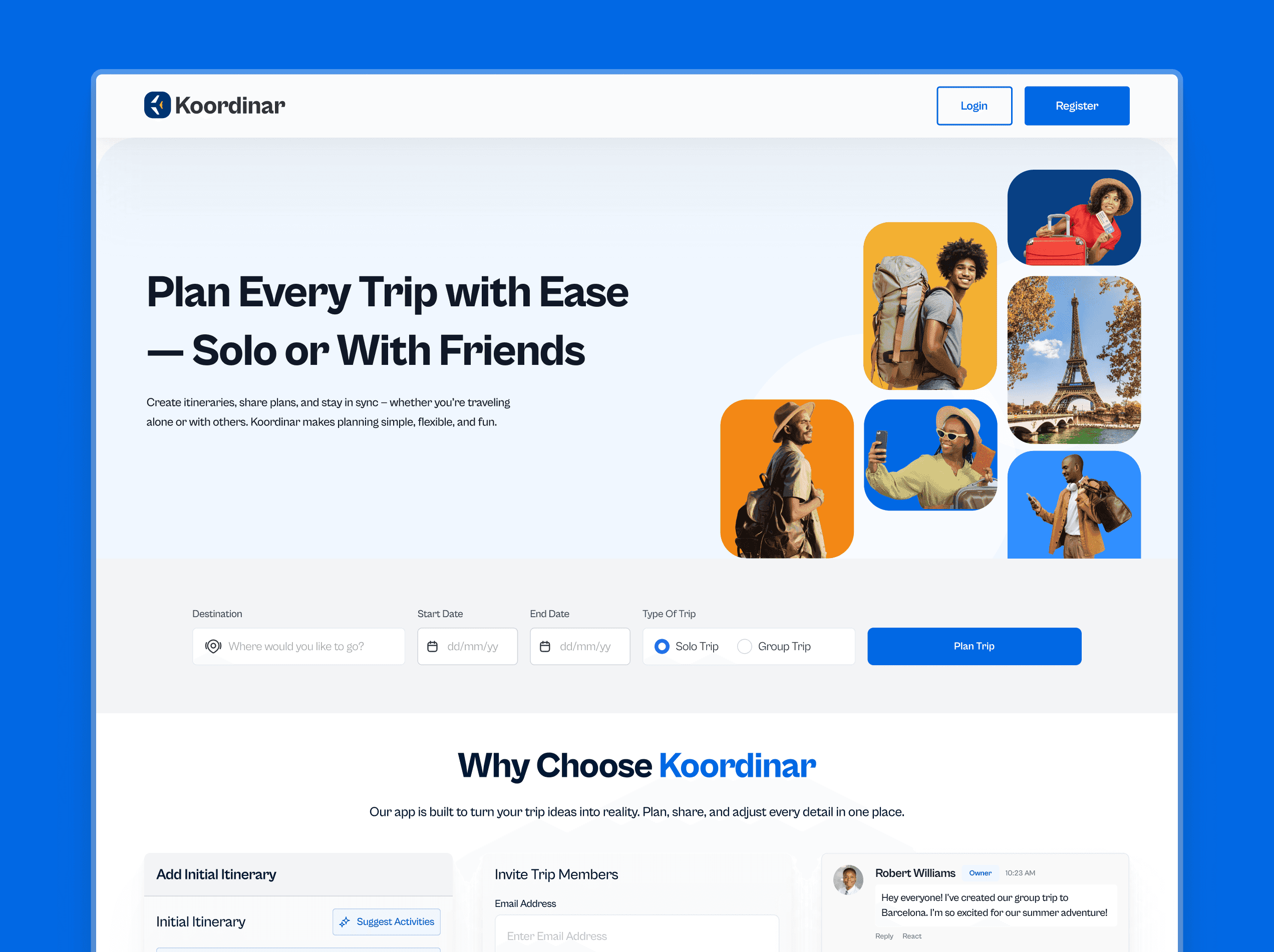
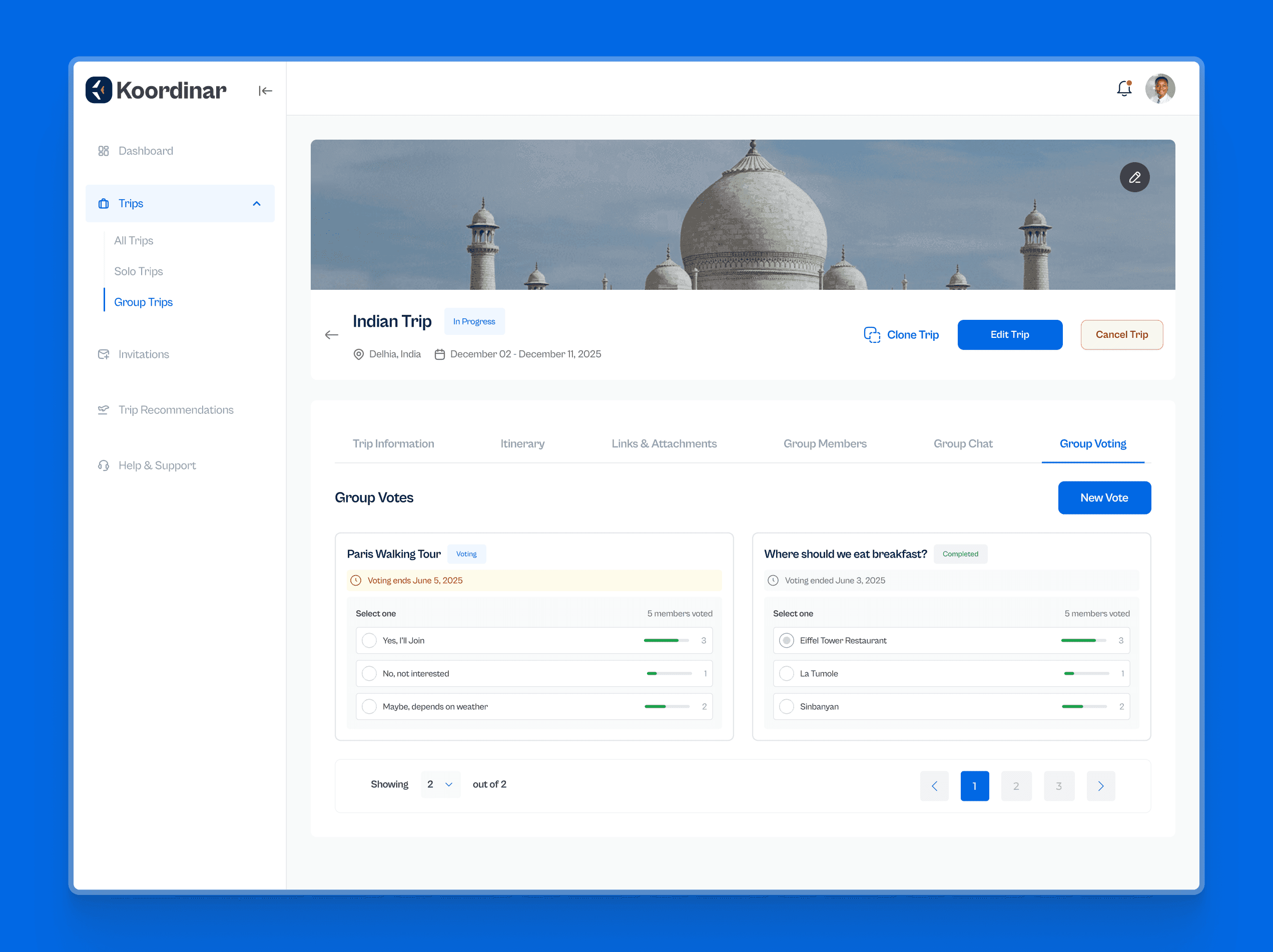
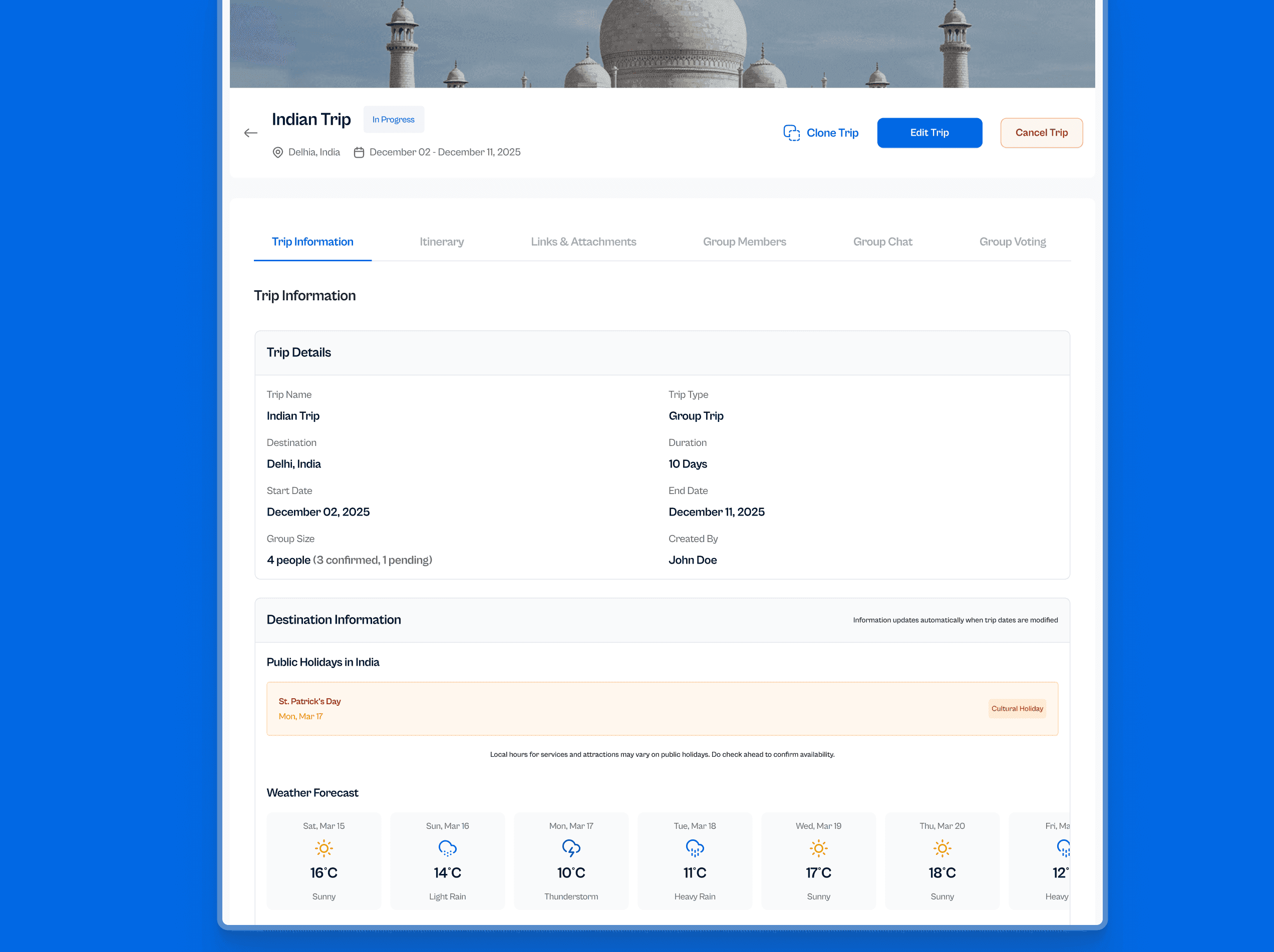

Still open
What I would do in the next pass
Voting has no tie-break
Four votes against four is a real outcome and the design currently has nothing to say about it. A tie needs either an owner who decides or a rule the group agreed to in advance. Probably the former, since the alternative is a settings screen nobody will read.
Notifications will not survive a real group
The feed groups updates by type, which holds at the volume shown here. A trip with 8 people actively planning generates far more than that, and grouping by type stops being enough the moment two categories are both busy. It needs digesting, not just sorting.
Nothing is actually booked
The product coordinates a decision and then hands it off. That is a defensible line to draw, but it means the last mile, the part where money changes hands and the trip becomes real, still happens somewhere else, which is exactly where the old fragmentation crept in.
Coordination problems look like tooling problems and almost never are. The work here was deciding what belongs on the same screen, and then refusing to add anything that didn’t.